Georgetown University Library Showcase – Data Visualization Projects
Spring 2021
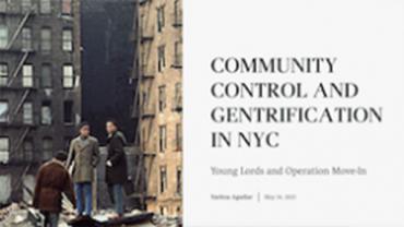
This project is a website of a digital exhibit highlighting several efforts of community control in Harlem.

Fall 2020
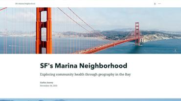
This story map provides an overview of community health in the Marina District of San Francisco, exploring various social determinants of health.
Fall 2018
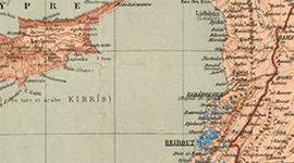
This project shows the geography of migration in the early-twentieth century Eastern Mediterranean.
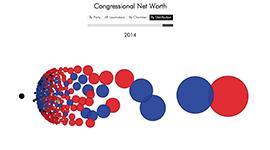
How wealthy is Congress?
Spring 2018
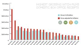
Digital Witchcraft investigates the dialogue and images of witch films.
This project demonstrates environmental racism in Detroit.