Introduction
This exhibition is a celebration of color, specifically as achieved by artists working in the medium of wood block printing. The art of carving into wood to create a two dimensional image which can be used to create multiple impressions is the oldest form of graphic art. Color in Relief presents over 40 examples of this printmaking technique. The exhibition is not a comprehensive survey, but an overview of some of the high points in the medium’s development, with emphasis on American prints of the twentieth century.
Although color wood block printing was known in Asia from at least the 8th century, it was also invented independently in Europe around 1400. The technique was soon adapted for use in the new printing press, and the earliest color press-printed book illustrations co-existed with traditional methods of hand coloring.
The 16th century introduced the innovation of the chiaroscuro wood cut, in which subtle variations in tone create images with shadows and highlights that seek to reproduce drawings and watercolors. While the chiaroscuro technique produced some stunning results, it was soon eclipsed by engravings as the preferred method for reproducing artwork.
Meanwhile, in isolated Japan, artists were developing color wood block printing in a different direction: instead of illustrating books or reproducing paintings, prints became works of art in their own right. A pinnacle of Japanese color wood block printing was achieved in the ukiyo-e prints of the late Edo period. When these masterpieces became known to artists in Europe after the opening of Japan, they inspired the Impressionists, engendered Japonisme, and set the groundwork for a back-and-forth exchange of influence that lasted throughout the Arts and Crafts period.
In the United States, color wood block prints were introduced to the broader public during the Depression, when government-sponsored art projects made use of many printmaking techniques both to further New Deal ideologies and to keep artists working. Many American artists who participated in the Federal art programs then became early members of the brand-new American Abstract Artists group in 1936. The AAA was the wellspring of the abstract art movement in America, and printmaking was a focus of experimentation and innovation for its artists. They explored the expressive qualities of color, form, and the wood block itself, bringing together age-old and innovative techniques that continue to move this age-old medium forward.
Early Woodcuts
![Untitled [Walled Cityscape] from the Nuremberg Chronicle](/sites/default/files/1979.6.59.jpg)
Untitled [Walled Cityscape] from the Nuremberg Chronicle
Michael Wolgemut (workshop of) (1434 – 1519)
ca. 1497
Woodcut with hand coloring
184 x 140 mm
Gift of Eric F. Menke
1979.6.59
First published in 1492, the Liber Chronicarum or Nuremberg Chronicle, is widely regarded as an outstanding example of early printing largely due to the quality of its illustrations and masterful typography. Here we see a hand-colored illustration of a medieval town, removed from a full sheet that would have also contained text. The woodcuts were produced in the workshop of Michael Wolgemut, and it is thought that the young Renaissance master Albrecht Dürer, who was studying under Wolgemut, could have designed some of them. The Liber cataloged the history of the world from its origins in the Bible, including medieval and contemporary events mixed with fables, myths and legends. Many famous people and cities from throughout the world are depicted, but illustrations were often repeated in the book with only the labels changed. Of over eighteen hundred illustrations there are fewer than seven hundred unique images. Simultaneously printed in Latin and in German editions, it was the most lavishly illustrated book of its time and became so popular that an unauthorized, cheaper version appeared just four years later.
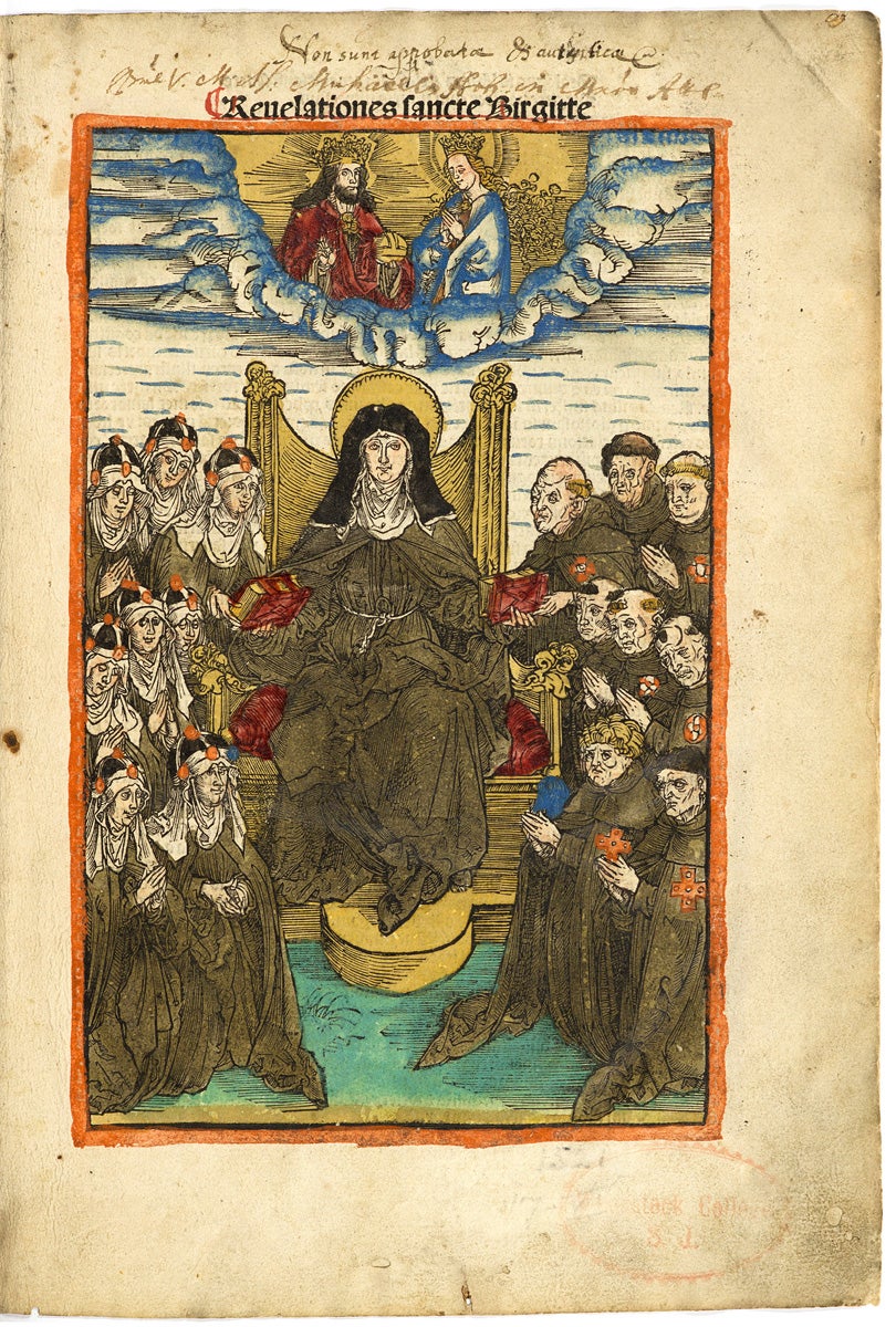
Reuelationes sancte Birgitte
Saint Bridget of Sweden (approximately 1303-1373)
Nuremberg: Anton Koberger, 1500
Woodcut with hand coloring
On loan from the Woodstock Theological Library
248.162 B768 INC
This illustrated volume on the life of Saint Birgitta of Sweden has a hand-colored image of the enthroned saint on its title page, and is richly illustrated throughout with hand-coloring. The book was published by Anton Koberger, a former goldsmith and publisher of the Nuremberg Chronicle represented nearby. Koberger was the most successful publisher in Germany at the time and godfather to Albrecht Dürer, who may have contributed to the woodcuts. A year before Dürer’s birth in 1471, Koberger established a printing and publishing business that eventually grew to 24 presses with some 100 workers publishing highly elaborate editions by numerous authors simultaneously. The later success of Dürer’s single leaf woodcuts (individual woodcuts not bound in a volume) would further elevate the status of the woodcut medium as the demand grew among collectors of his prints.
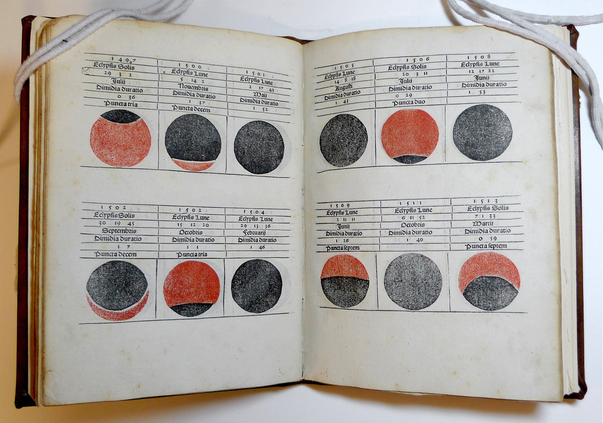
Kalendarium magistri Joannis de Monteregio viri peritissimi
Joannes Regiomontanus (1436-1476)
August[a]e Vindelicor[um] Augsburg: Erhardi Ratdolt, 1489
Color woodcut
Booth Family Center for Special Collections Rare Books Collections
Shea Collection
CE91 .R45 1489 Vault
This volume on astronomy is widely regarded as the first example of color woodcut printing, or printing in register. In this process, two blocks were used for each color and were printed separately on the same sheet. The book’s printer, Erhard Ratdolt, was active in Venice from 1476 to 1486 and later in Augsburg, producing elegant volumes with decorated initials and floral motifs in red and black. During his career as a publisher of scientific works he released the first edition of Euclid’s Elements (1482), as well as the first example of a specimen book for printers.
Regiomontanus, whose name is a Latinized form of “king’s mountain,” was an internationally recognized astronomer, mathematician and astrologer who was working on a solar centered theory of the universe before he died in Rome at the age of 40. A woodcut portrait of Regiomontanus was published in the Liber Chronicarum, represented nearby. With his many influential publications he established Nuremberg as the center for mathematical and astronomical studies and founded the first scientific press in 1472. These diagrams in his Kalendarium represent lunar and solar eclipses. A crater of the moon was named for Regiomontanus in the 17th century.
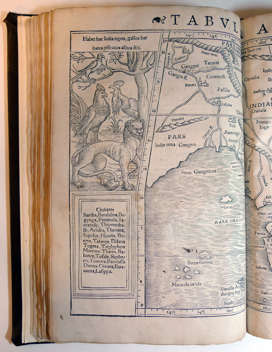
Geographia universalis: vetus et nova / complectens Clavdii Ptolemæi Alexandrini enarrationis libros VIII; quorum primus noua translatione Pirckheimheri et accessione commentarioli illustrior quàm hactenus fuerit, redditus est ... ; succedunt tabulae Pto
Ptolemy (2nd century)
Basileae: Apud Henricum Petrum, 1542
Woodcut
Booth Family Center for Special Collections Rare Books Collections
83B27
This woodcut map of Southeast Asia is the work of Sebastian Münster, one of the foremost cartographers of the 16th century. His most famous work, Cosmographia (1544), was the first German history of the world. Ptolemy’s second century Geographia Universalis was translated into Latin in 1406, and the first edition to be illustrated with maps appeared in Bologna in 1477. Münster’s depiction of Ptolemy’s Asia features a fanciful tiger and fowls native to the region. The naïve interpretation of the tiger suggests Münster probably never saw one in person and may have drawn upon verbal descriptions or other visual resources for information on this exotic beast.
Chiaroscuro
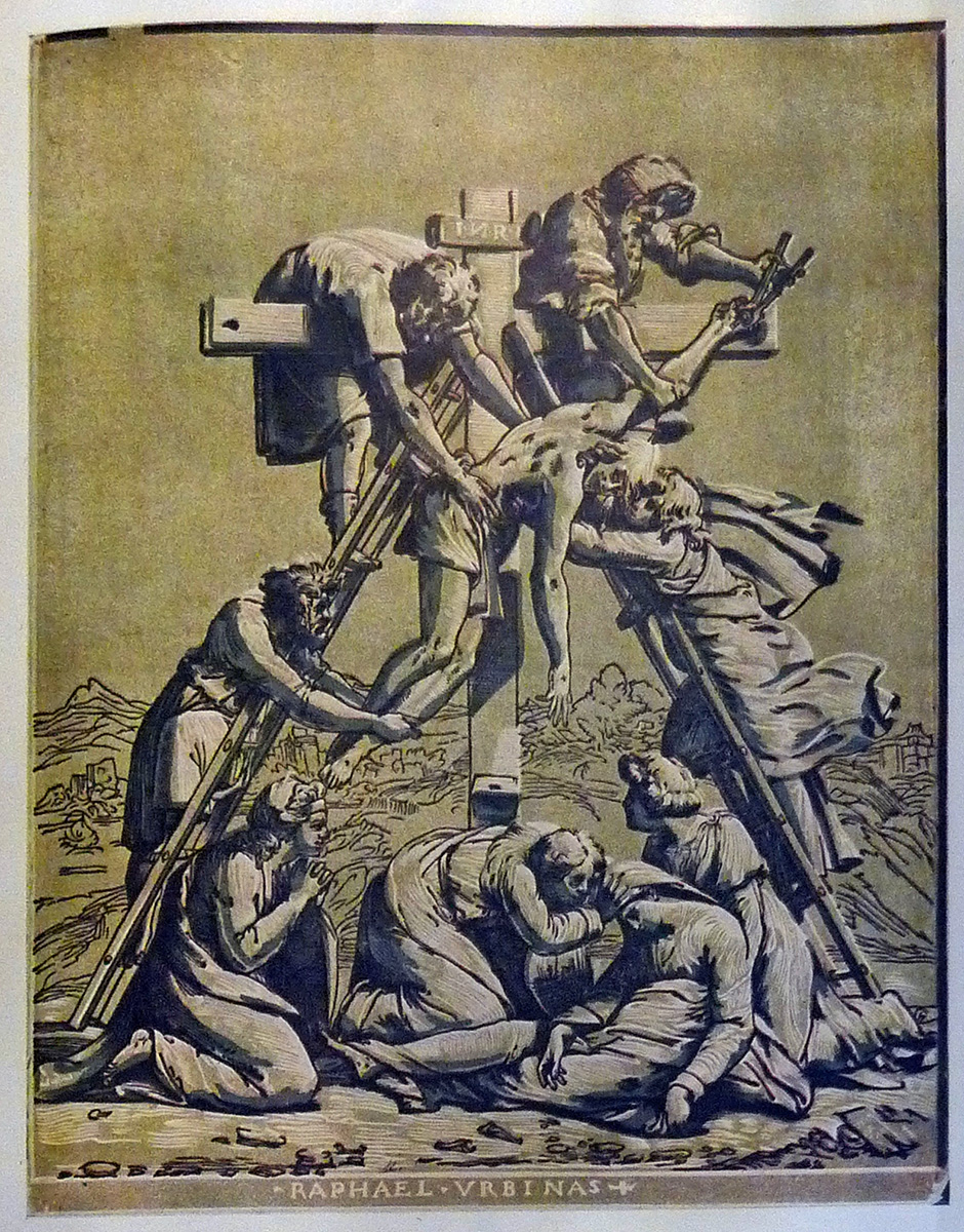
The Modern Woodcut: A Study of the Evolution of the Craft, With a Chapter on the Practice of Xylography by W. Thomas Smith
Herbert Furst (1874-1945)
London: J. Lane, 1924
Booth Family Center for Special Collections Rare Books Collections
98A1331
This page from The Modern Woodcut shows a chiaroscuro woodcut by Ugo da Carpi (1480 - 1523) reproducing a drawing by Raphael of The Descent from the Cross. Ugo applied for a patent from the Venetian senate for this technique, which he described as making prints that look as if they had been painted. He was one of the leading artists of the medium in Italy and expertly translated designs of popular artists into prints that could more widely disseminate their works among an avid public.
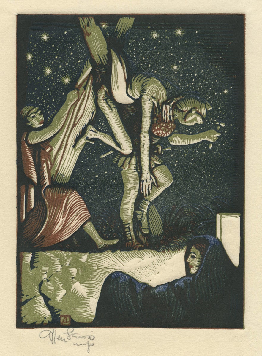
Illustration from The Satyricon of Petronius Arbiter (The Deposition)
Allen Lewis (1873 - 1957)
1927
Color woodcut
130 x 95 mm
Art Collection Purchase
1990.18.5
In the twentieth century, artists working in relief printmaking were inspired by the innovations of the Old Master printmakers. This woodcut by Allen Lewis uses the highlighting effect seen in Ugo’s chiaroscuro to create the effect of a lamp shining on the figures at night. Lewis had a long career and was known for his woodcuts, bookplates, and illustrations for over 16 books. This image was created to illustrate a translation attributed to Oscar Wilde of Petronius’s first century novel, the Satyricon.
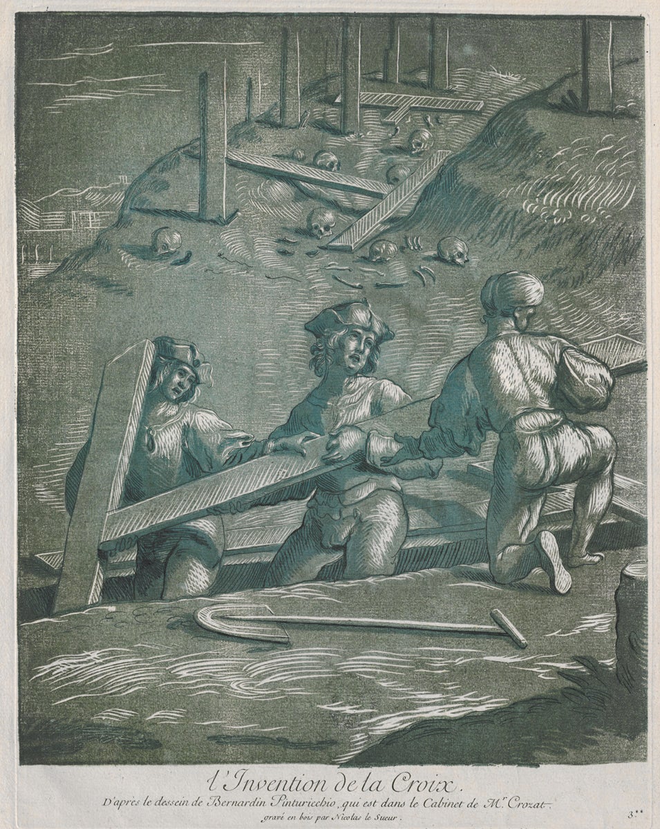
The Discovery of the Cross
Nicolas Le Sueur (1691-1761)
ca. 1730
Chiaroscuro woodcut
376 x 312 mm
Art Collection Purchase
####.1.659
This French chiaroscuro was created more than two centuries after its development in Germany and Italy. Here the dark lines were printed first, followed by the tone blocks in progressively lighter shades, carefully measured to register perfectly, maintaining the clarity of the design. Le Sueur’s image is based on a fresco depicting the Discovery of the Cross by St. Helena, originally painted by the Italian Renaissance master Pinturicchio in the Basilica of the Holy Cross in Jerusalem, one of the seven pilgrimage churches in Rome.
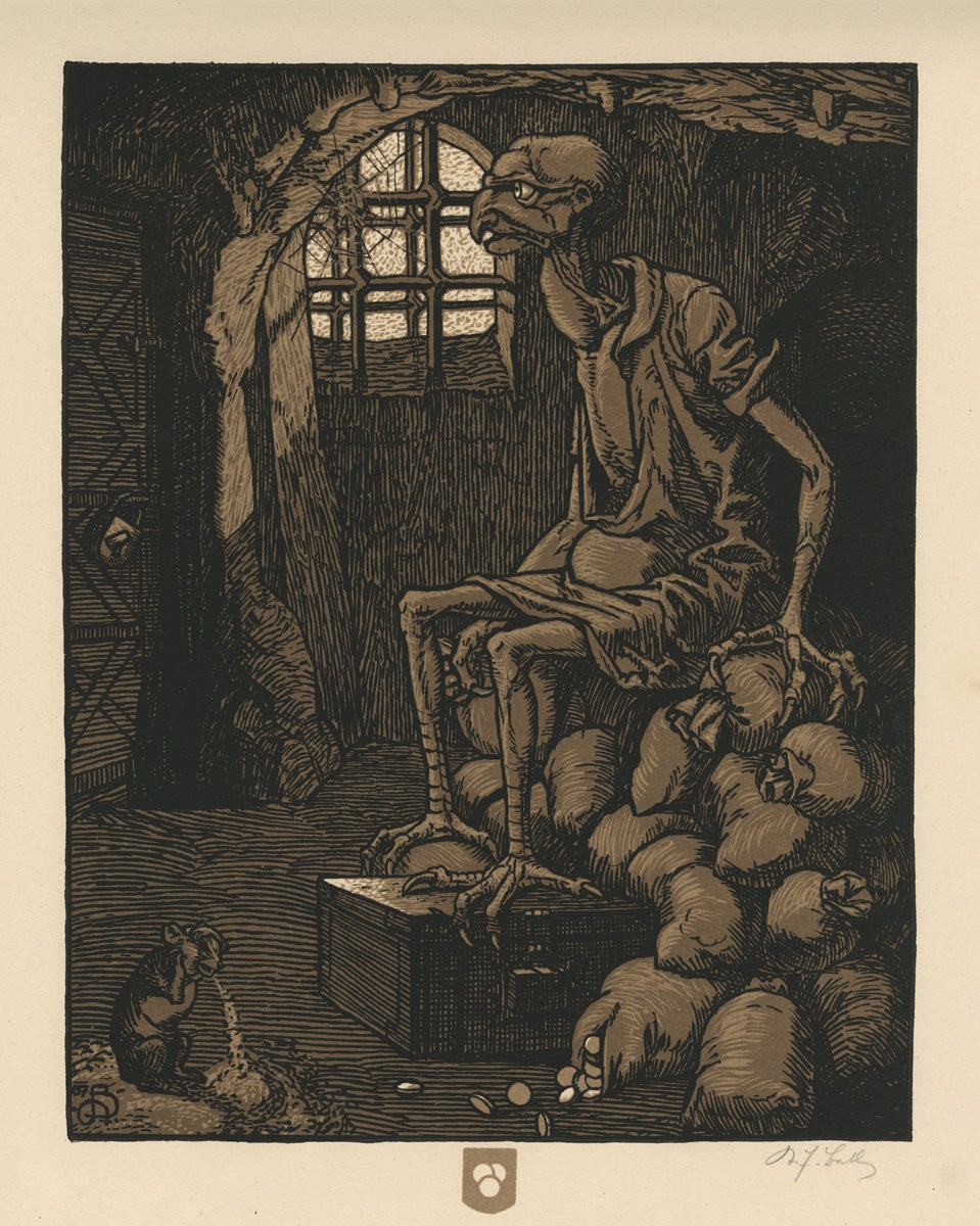
Die Sieben Lasterteufel
Karl Friedrich Bell (1877 - 1958)
1922
Color woodcut
1/100
290 x 224 mm
Art Collection Purchase
2014.31.1
Karl Bell was a Viennese artist and writer who in 1913 joined the Vienna Secession movement, the Austrian equivalent of French Art Nouveau. Founded in 1897 by Gustav Klimt, Koloman Moser and others, these artists reacted against the conservatism of the prevailing academic school which favored history painting in the visual arts. Bell’s macabre woodcut depicting the sin of avarice, or greed, is from the portfolio Die Sieben Lasterteufel, related to his 1910 illustrated epic poem of the same subject.
The theme of the seven sins, which include sloth, envy, lust, gluttony, wrath and pride, was popular in the medieval era as a form of moral instruction and a guide to Catholic confession. It figures prominently in Chaucer’s “Parson’s Tale” and in the second book of Dante’s Divine Comedy. In the visual arts, Peter Brueghel the Elder and Hieronymus Bosch both populated their series on the seven deadly sins with similar, demonic creatures.
Japanese Woodcuts and Their Influence
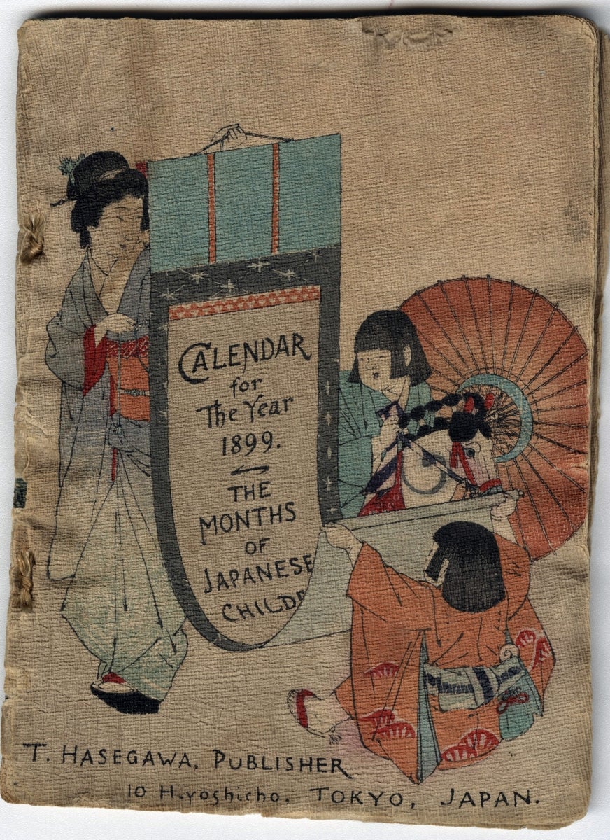
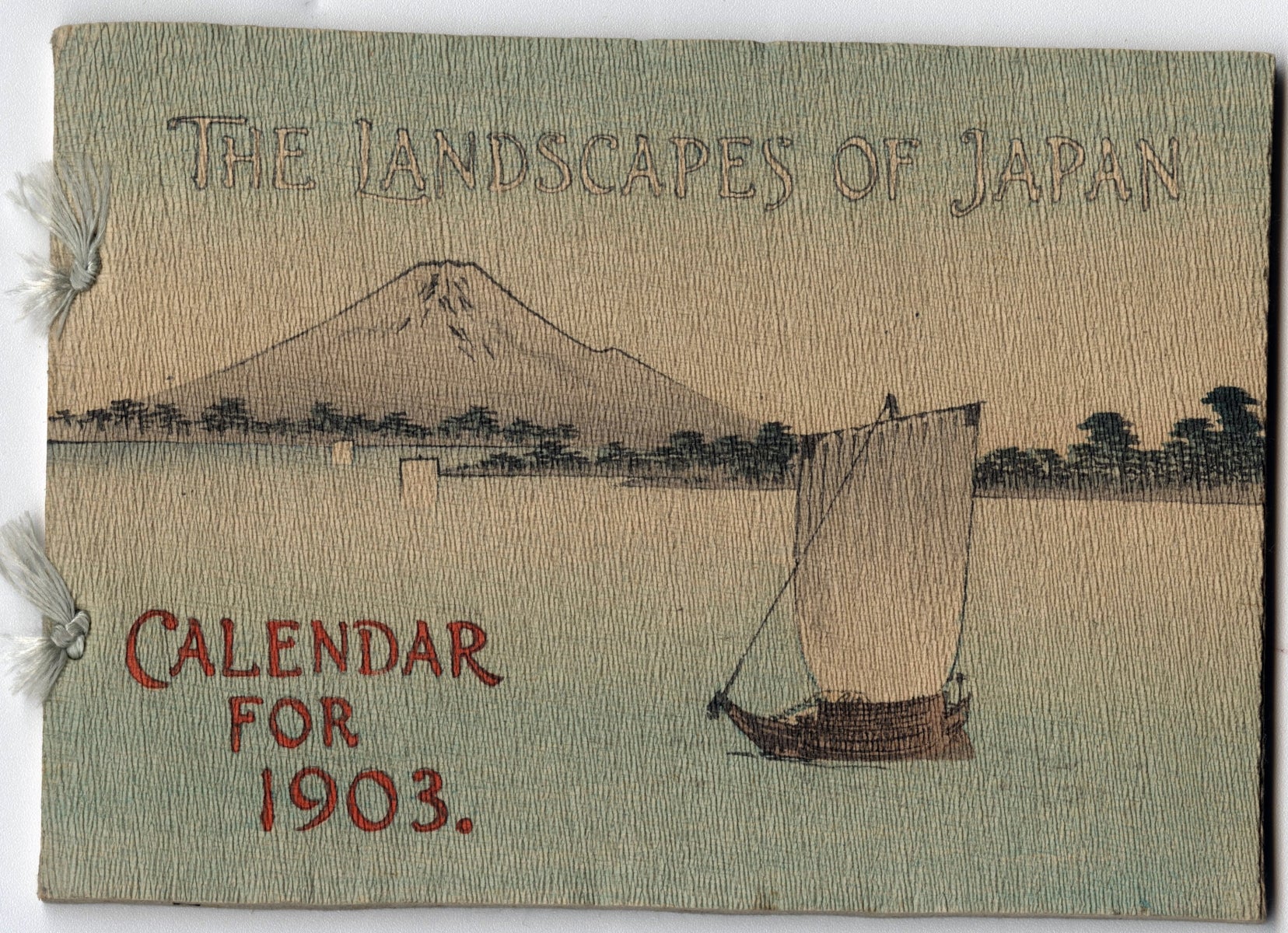
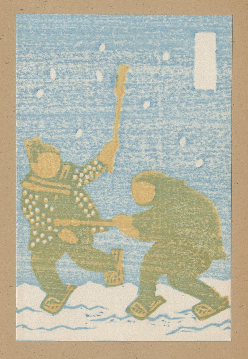
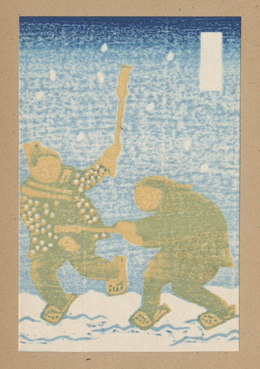
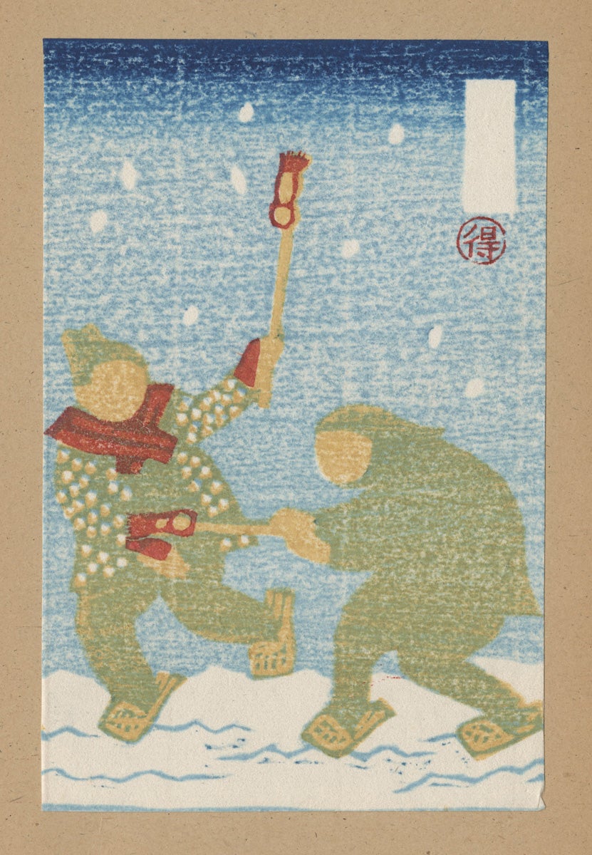
Two Calendars
Takejirô Hasegawa (1853 - 1938)
1899 and 1903
Color woodcut on crepe paper
128 x 178 mm
Gift of Ingrid Rose in Memory of Milton M. Rose
Hasegawa Takejirô was a successful Tokyo publisher who catered to foreign tourism and the demand for Japanese cultural exports. He published a series of over 20 Japanese fairy tales with original woodcuts printed on crepe paper, very similar to these two calendars. His fairy tales were translated into many languages and widely distributed in Europe and America. The calendar for 1903 displays picturesque landscape views and the one for 1899 celebrates popular festivals for children.
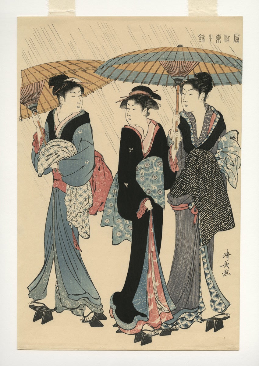
Three Women in the Rain, from the series Current Manners in Eastern Brocade (Fûzoku Azuma no nishiki)
Torii Kiyonaga (1752 - 1815)
ca. 20th century printing, after 1783 original
Color woodcut
Art Collection Purchase
####.1.5061
Torii Kiyonaga was one of the greatest masters of the nishiki-e technique. He was born Sekiguchi Shinsuke but used the adopted name when he was chosen to succeed his teacher, Torii Kiyomitsu as the leader of the long-established Torii school, or family of printmakers. Beautiful women and courtesans were among his typical subject matter.
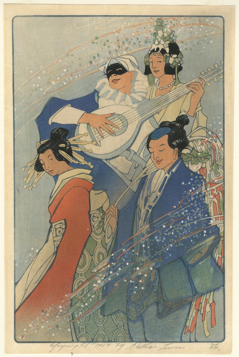
Costume Ball
Bertha Boynton Lum (1879 - 1954)
1924
Color woodcut
ed. 50
375 x 244 mm
Art Collection Purchase
####.1.653
Bertha Lum’s prints emerged at the time when Japonisme was firmly in vogue in America and display the ukiyo-e style within a Western approach to illustration. While visiting Japan on her honeymoon in 1904, she became fascinated with ukiyo-e prints and visited a printing shop to observe the technique. Although her first attempts at home were unsuccessful, during a second trip to Tokyo three years later, she trained with a master engraver and a printer for three months. Back in America she began creating her own prints, at first performing the cutting and printing herself, later employing others to help with the labor intensive process. In 1915 she received a silver medal from the Panama-Pacific International Exposition for her color woodcuts.
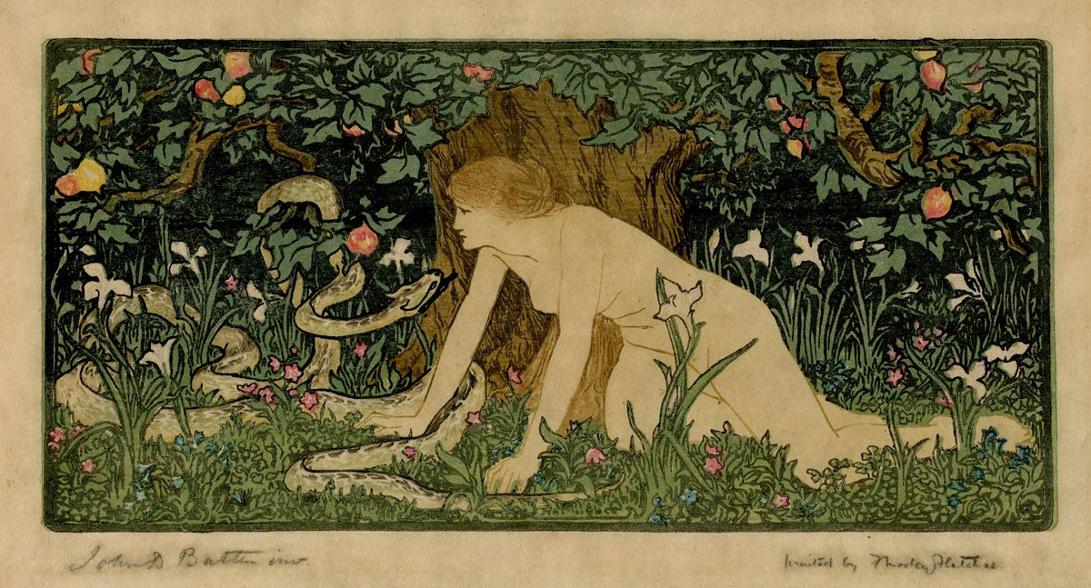
Eve and the Serpent
Frank Morley Fletcher (1866 - 1950)
John Dickson Batten (1860 - 1832)
1895
Color woodcut
ed. 35
137 x 281 mm
Art Collection Purchase
2014.35.1
Eve and the Serpent was the first British print created in the Japanese manner, as announced by Frank Morley Fletcher in The Studio magazine in 1896. The pioneering work began as a black and white frontispiece to a children’s book and involved six wood blocks, one metal block, and a wallpaper block cutter. The process was described in detail in The Studio in February 1896, and was soon followed by another print, The Harpies, both of which were immediately purchased by the South Kensington Museum. Fletcher’s influential handbook, Wood-Block Printing; a Description of the Craft of Woodcutting and Colourprinting Based on the Japanese Practice (1916), was instrumental in the transfer of the Japanese style and technique to artists in America.
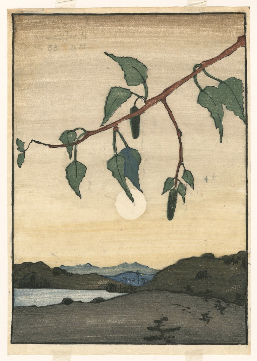
The Branch (Moonrise)
Bror Julius Olsson Nordfeldt (1878 - 1955)
1902
Color woodcut
No. 88
283 x 203 mm
Gift of Laszlo Ecker-Racz
1981.8.2
The Swedish-born Bror J. Olsson-Nordfeldt immigrated to America with his family at the age of thirteen, and began instruction at the Chicago Art Institute in his early twenties. In 1900 he traveled to Paris to work on a mural commission as an assistant to the artist Albert Herter (1871 - 1950). While in Paris Nordfeldt studied briefly at the Académie Julian where he was inspired by the aesthetic of Japanese wood block prints and the French fascination with the art form. During his stay in Europe he also visited England and studied with the innovative printmaker Frank Morley Fletcher, whose masterful woodcut, Eve and the Serpent, is shown above.
Nordfeldt settled in Chicago in 1903 and for the next four years created fifteen color woodcuts, which he laboriously designed, carved, and printed himself. The Branch, Moonrise dates to the same year that Frank Lloyd Wright’s collection of landscape prints by Utagawa (Andô) Hiroshige was exhibited at the Art Institute of Chicago, the first-ever museum exhibition of the Japanese master’s work.
![Die Näherin [The Seamstress]](/sites/default/files/1992.17.3_det.jpg)
Die Näherin [The Seamstress]
Emil Orlik (1870 - 1932)
1900
Color woodcut
165 x 157
Art Collection Purchase
1992.17.3
This two-color woodcut by Emil Orlik shows the influence of the Jugendstil art movement that emerged in Munich in the 1890s. This decorative style blended Art Nouveau with Japanese prints and applied arts. Orlik had traveled through Europe and visited Paris shortly before this woodcut was created. The quiet interior scene is evocative of painters like Whistler and Vuillard who also were greatly inspired by the Japanese aesthetic. As he later wrote, “the joy I take in craft, which nature gave me for better or for worse, led me to Japan in 1900. There, in the workshops of the woodcutters and printers, I sought to understand the wonderful technique of the Japanese, and to use it in my own ways.”

Devil's Bridge - St. Gothard's Pass
Urushibara Yoshijiro (aka Mokuchu) (1888 - 1953)
After a drawing by Frank Brangwyn (1867 - 1956)
ca. 1918
Color woodcut
21/52
364 mm x 505 mm
Art Collection Purchase
1980.5.2
Urishibara traveled to Paris and then to England in 1912 where he was hired by the British Museum to make one hundred facsimile woodcuts of a famous 4th century Chinese scroll painting. He remained there over thirty years, where he was highly influential in the revival of the color wood block print as a fine art form. Urushibara partnered with the artist Frank Brangwyn to reproduce the latter’s watercolors in two distinctive portfolio editions. This woodcut depicts the famous Alpine bridge over the precipitous St. Gothard’s Pass, with the older bridge in the foreground, supposedly built by monks, echoed by the higher, arched bridge built in 1830 behind. Brangwyn’s original ink drawing of the bridge was reproduced in A Book of Bridges (1915), with a description. According to legend, a local woman lost her only cow which appeared across the ravine spanning the Mynach cataract. The devil, disguised as a monk, promised to erect a bridge across the chasm of some 115 feet in exchange for the first living being to cross over it. Perceiving the monk’s true identity, the woman figured out a way to trick the devil and sent a dog over the bridge in payment of her debt.

The House at Saku
Shimozawa Kihachiro (1901 - 1984)
ca. 1930-1939
Color woodcut
398 x 515 mm
Art Collection Purchase
####.1.2624
This print is an example of the twentieth century “creative prints” (sôsaku-hanga) movement in Japanese graphic arts. A group of innovative artists led by Un’ichi Hiratsuka, Shikô Munakata and Kôshirô Onchi departed from the traditional nishiki-e division of labor. They pioneered the art of printmaking as a highly personal process with one artist performing all the tasks including designing, cutting or carving, printing, and marketing. Shimozawa’s mentor was Hiratsuka, who taught the younger artist a more simplified method of printmaking, “dominated by the artist rather than the artisan.” Shimozawa exhibited his first print with the Hanga Association in 1924 and from 1936 onward devoted his efforts exclusively to printmaking. He is known for landscapes and prints featuring windows or doorways.
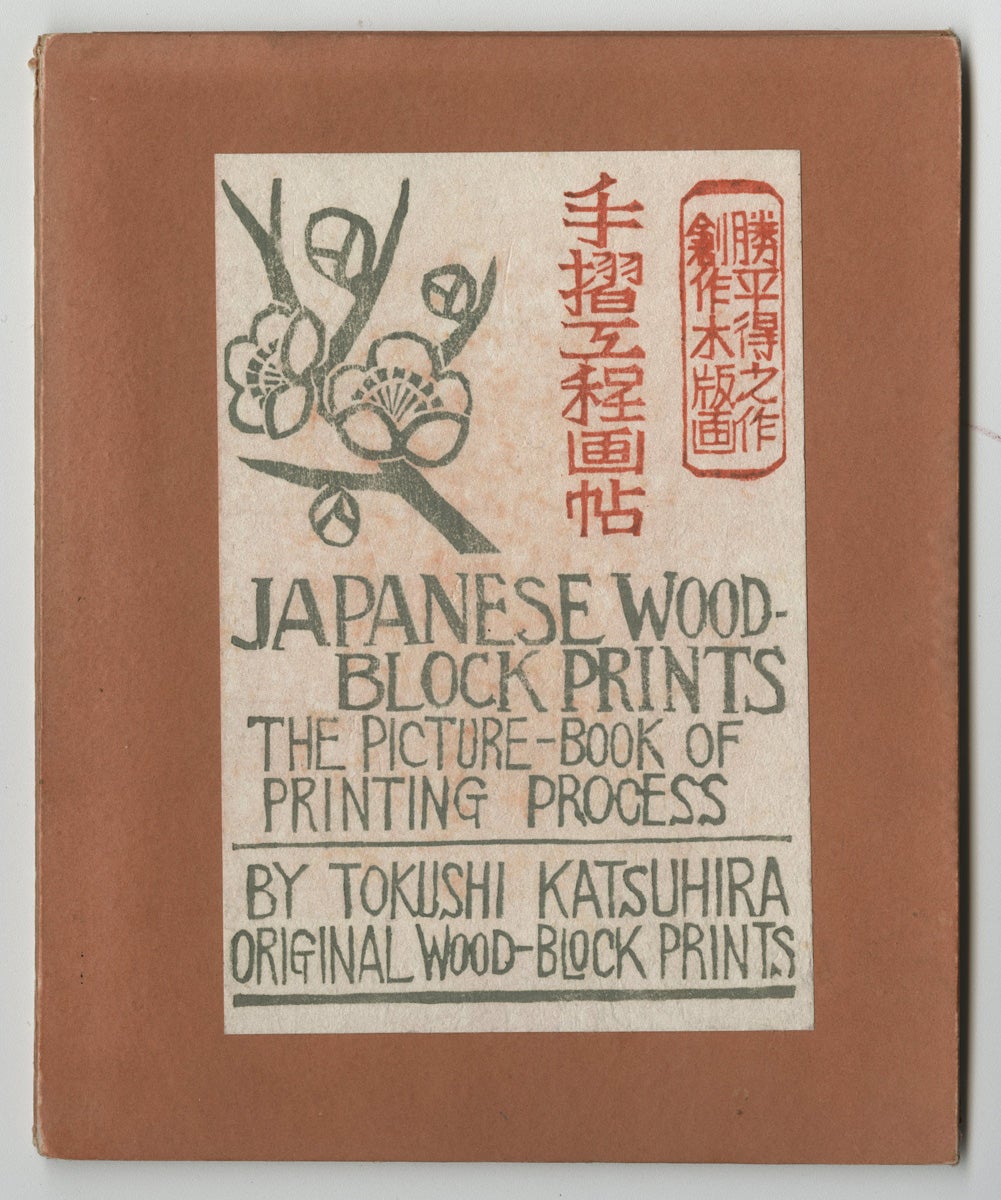
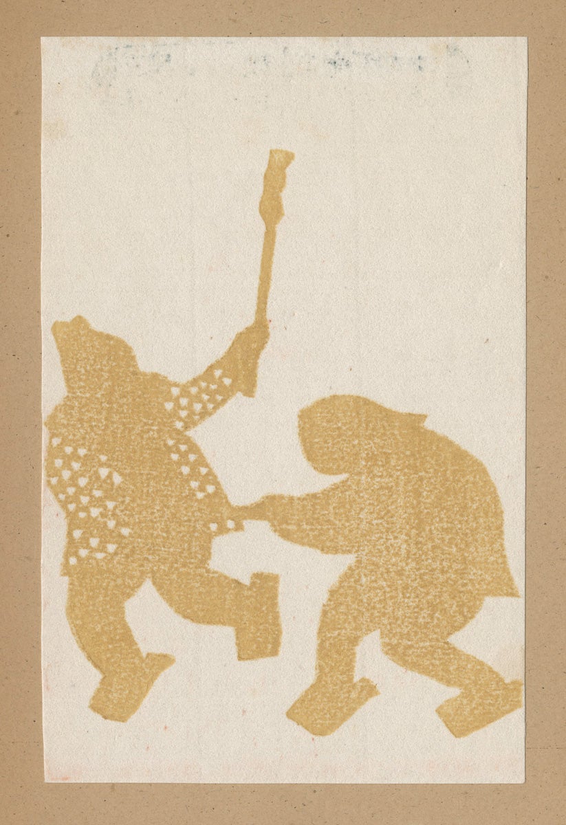

Japanese Woodblock Prints: The Picture Book of Printing Process
Katsuhira Tokushi (1904 - 1971)
ca. 1930-1940
Color woodcut
147 x 98 mm
Art Collection Purchase
####.1.4987
Katsuhira Tokushi was from a modest farming background in the northern Prefecture of Akita, far from the cultural capitals of Tokyo or Kyoto. He did not have formal art training, but in 1928 took a class in woodcarving as part of the “Farmers Art Movement,” related to the “creative prints” movement (sôsaku-hanga) in that it empowered ordinary laborers to develop their creative potential. Katsuhira developed a unique style of printmaking and exhibited his work with different artists groups, earning the Culture Prize from the Akita Prefecture in 1951. This step-by-step guide shows the progressive states in printing five colors, beginning with yellow and ending in black. The fading of the blue in the top level of the sky is a technique called bokashi, achieved by brushing a graded amount of ink onto the moistened block.
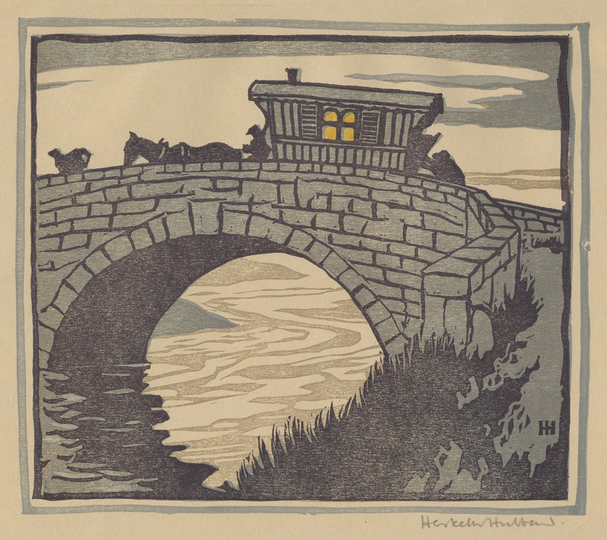
Over the Bridge
Eric Hesketh Hubbard (1892 - 1957)
Color woodcut
193 x 219 mm
Art Collection Purchase
1992.8.51
This four-color woodcut by British artist Eric Hesketh Hubbard employs a sinuous pattern to convey the reflective surface of the water under the bridge. The carving of the wood in this way is similar to the folds of fabric in the lap of The Seamstress by Emil Orlik. Although Hubbard was primarily known as a painter, he was also adept at this experimental medium and his work is evocative of the style of sôsaku-hanga, the “creative prints” movement in Japan and seen in the woodcut by Shimozawa above. Hesketh Hubbard’s economical use of the color yellow creates an eye-catching effect of artificial light from the wagon’s window.
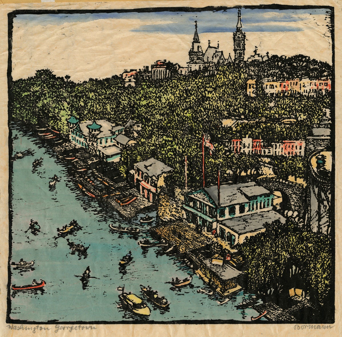
Washington - Georgetown (University)
Emma Bormann (1887 - 1974)
1950-1955
Color woodcut
345 x 355 mm
Gift of Eric F. Menke
1979.6.40
Emma Bormann was a talented Austrian artist among the first women to earn a PhD at the University of Vienna, in Archaeology. In 1917, she began making woodcuts at the School of Applied Arts. Throughout her life Bormann traveled extensively, visiting daughters in Tokyo and Riverside, California, and living in Shanghai during the Second World War. She toured America in 1936 and visited cities along the east coast including Washington, D.C., as well as Milwaukee and Chicago. This inspired a number of colorful woodcuts which she probably executed after returning to Vienna. Bormann’s sweeping aerial view of the Potomac River in Georgetown, possibly hand-colored, is typical of her popular city views.
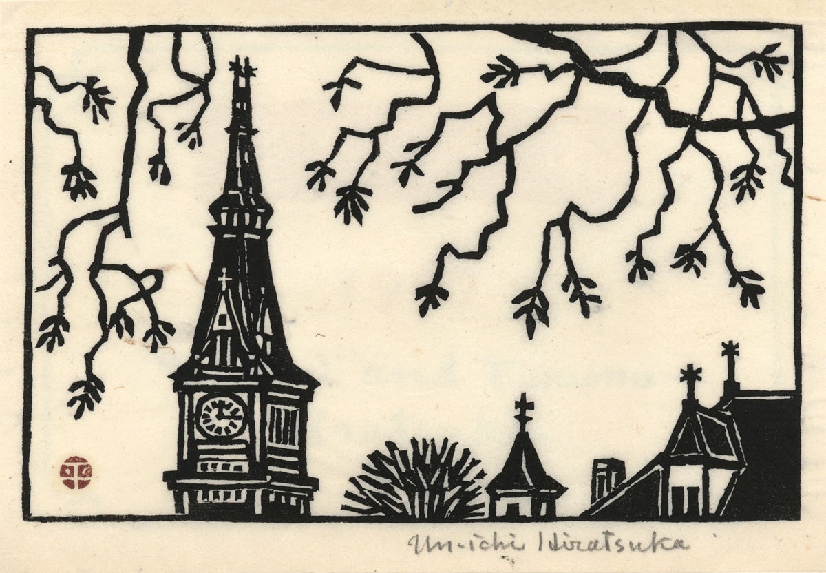
Georgetown University Clock Tower
Un'ichi Hiratsuka (1895 - 1997)
1967
Woodcut
115 mm x 178 mm
Gift of Roderick Quiroz
1997.19.2
Un’ichi Hiratsuka was one of the leading printmakers of the “creative prints” (sôsaku-hanga) movement in 20th Century Japan. Among his protégés was Kihachiro Shimozawa whose woodcut House at Saku appears above. Hiratsuka moved to Washington, D.C. in 1962 and lived here thirty-two years during which he taught and influenced a number of artists. He was commissioned by Congress to create wood block prints of national landmarks including the Washington Monument, and received the Order of Cultural Merit from the Emperor of Japan in 1970.
Revival of Relief Printmaking in America
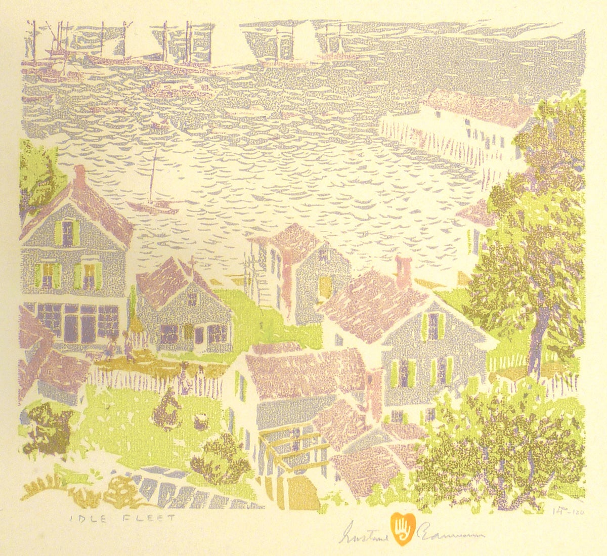
Idle Fleet - Provincetown
Gustave Baumann (1881 - 1971)
1931
Color woodcut
Second edition
14/120
241 x 278 mm
Art Collection Purchase
1987.4.1
Over his sixty-five year career, Gustave Baumann remained a dedicated practitioner of color woodcut working on the same Washington-type hand press in a methodical and exacting process based on the European tradition he learned in Munich in 1905. Baumann typically printed his images starting with the darkest color block first, continuing to the lightest. A consummate craftsman, Baumann designed, carved and inked from colors he mixed by hand. He habitually signed his work with the hand in heart chop mark at lower right, printed in his favored cadmium orange. Baumann began producing limited edition woodcuts in 1909, and in 1915 received a gold medal for color woodcut at the Panama-Pacific International Exposition.
This print was made during a brief sojourn in the Northeast after a six-year residence in Brown County, Indiana, where Baumann embraced the local landscape and working from nature. The absence of a black key block makes this print look much like the white line woodcuts then becoming popular in Provincetown, where he had visited the previous year and met with several of the local printmakers.
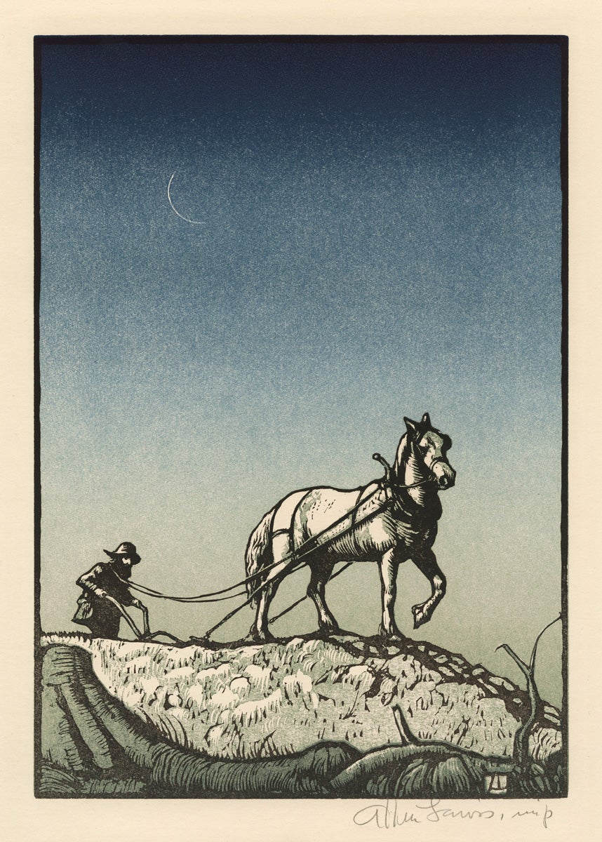
Twilight Toil
Allen Lewis (1873 - 1957)
1943
Color woodcut
ed. 200
255 x 179 mm
Art Collection Purchase
1984.6.7
Twilight Toil was released by the Woodcut Society of Kansas City, Missouri, which commissioned prints for its members bi-annually during the 1930s and 40s. Printed at the Torch Press in Cedar Rapids, Iowa, Twilight Toil was accompanied by a presentation folder with a lengthy text by the artist, Allen Lewis, a distinguished printmaker and teacher who had trained in Paris with Jean-Leon Gérome. Early in his career he had a photograph published in Alfred Steiglitz’s seminal journal, Camera Work, in 1912.
In the presentation text, Lewis explained that the expansive sky was intended to bring greater emphasis to the horse and figure. The design was printed from three blocks, two on end-grain maple and the grey tone block on linoleum. The modulation of color in the sky was printed on one block by applying a darker blue to one end of a roller and lighter blue to the other end. “And by a small movement from side to side the tints became blended on the roller before being transferred to the block.”
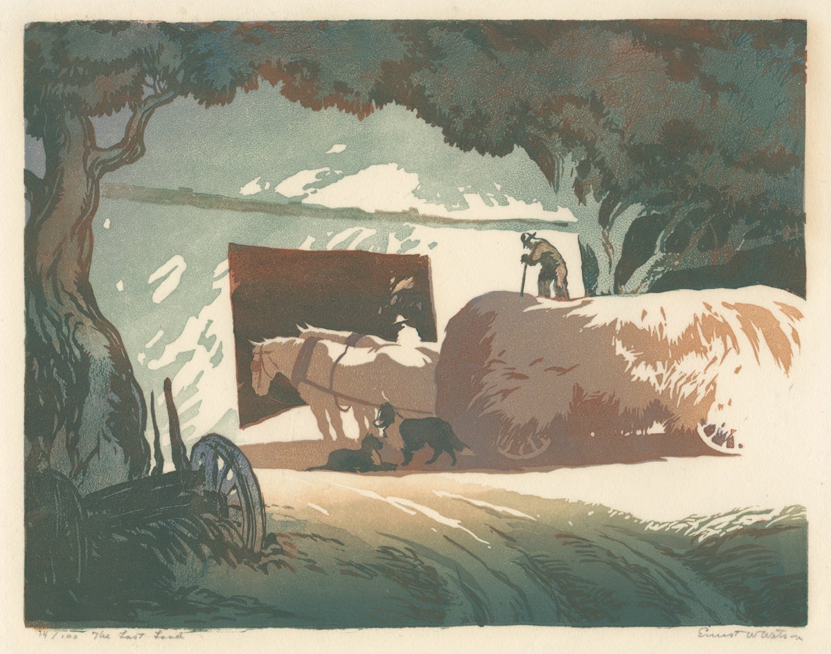
The Last Load
Ernest Watson (1884 - 1969)
ca. 1925
Color linocut
14/100
217 x 279 mm
Art Collection Purchase
1984.3.8
Ernest Watson was a co-founder of the Berkshire Summer School of Art in Monterey, Massachusetts in 1915 where he taught until 1927. Watson favored relief printing on a linoleum surface and innovated a new method of color printing together with his wife Eva, also a talented printmaker. Their process reversed the Japanese practice of laying the paper on top of the printing block, instead placing the paper in the press bed with the block on top to press the relief-cut image down onto the paper. They also printed combinations of two colors per block. As explained in Watson’s book The Relief Print, co-edited with Norman Kent, they preferred using linoleum because “their designs usually exploit[ed] mass rather than detail,” and using linoleum could be faster and easier than carving into wood.
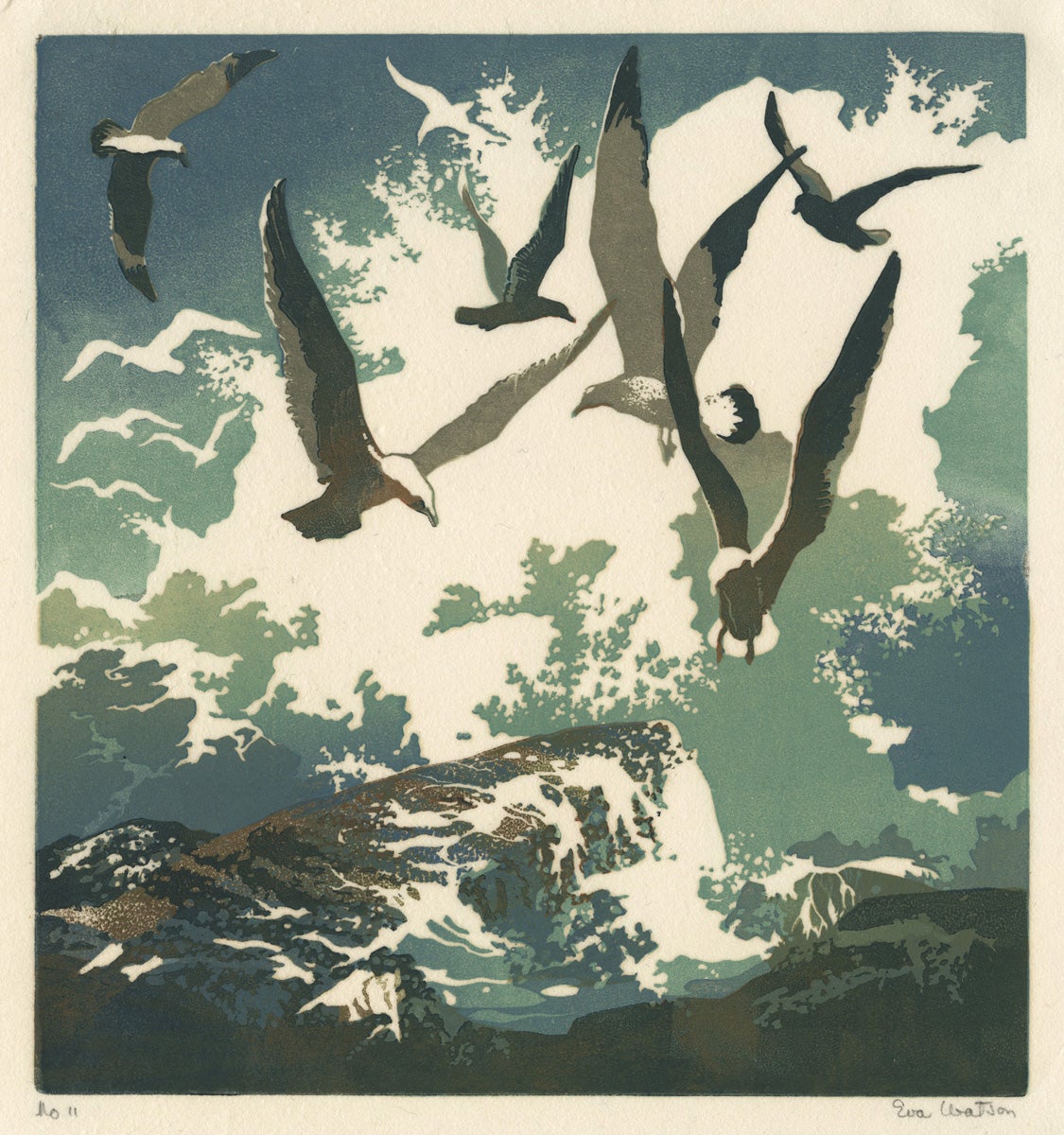
Gulls and Spray
Eva Watson (1889 - 1948)
1943
Color linocut
11/150
228 x 213 mm
Art Collection Purchase
1983.5.20
Eva Auld had been a student of Ernest Watson’s at the Pratt Institute in Brooklyn, before they were married in 1911. The Watsons shared a studio and both worked in linoleum, which is a smoother surface than wood and does not have a grainy texture. A comparison of their two prints reveals similar approach to color tonality and uniform evenness in printing. Mrs. Watson was also an illustrator and muralist. She described her relief process in detail in the 1945 book The Relief Print.
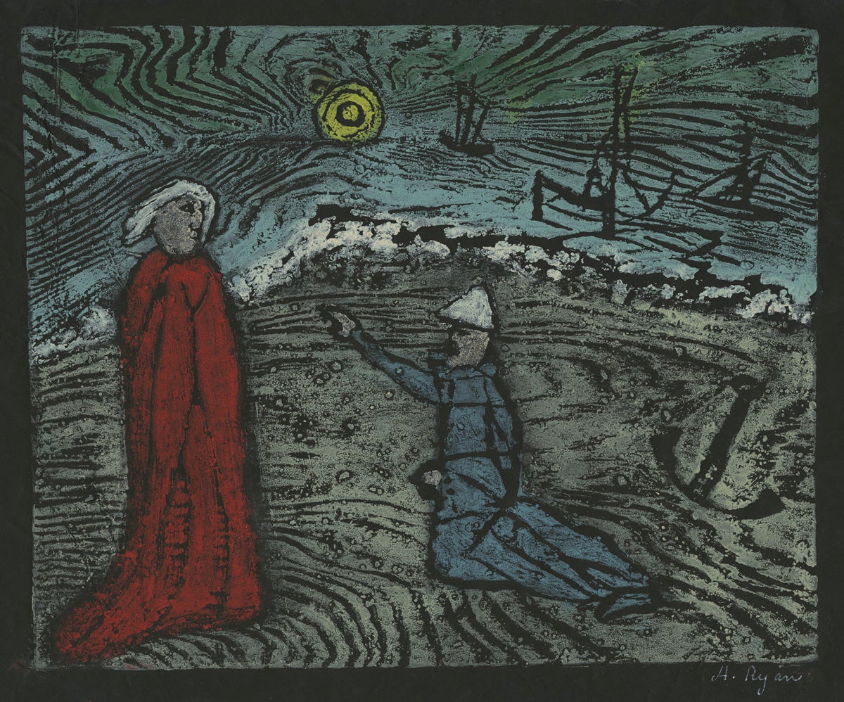
Now, Ever Alake, My Master Dear, I Fear a Deadly Storm!
Anne Ryan (1889 - 1954)
1947
Color woodcut
206 x 256 mm
Art Collection Purchase
1990.5.20
Artist and poet Anne Ryan revolved among the emerging Abstract Expressionist painters and literary figures of the 1930s and 40s in New York’s Greenwich Village. She began making prints while studying with British artist Stanley William Hayter, who established his influential workshop known as Atelier 17, transferred from Paris during the Second World War. This unusual woodcut printed on black paper is based on an old English ballad in the oral tradition entitled Sir Patrick Spens. First published in Thomas Percy’s Reliques of Ancient English Poetry (1765), the story is about an ill-fated Scottish voyage to Norway commanded by the king. Ryan’s woodcut was included in a portfolio of original prints entitled Laurels (number one, May 1947) released by the Laurel Gallery in New York. Other artists in the portfolio included Stanley William Hayter, Reginald Marsh and Joan Miró. Milton Avery’s drypoints printed by Hayter were published in the Laurel Gallery portfolio the following year. It is possible to consider that Milton Avery’s effective use of black, seen in his Rooster below, might have influenced Ryan’s design.
Rooster
Milton Avery (1885 - 1965)
1953
Color woodcut
ed. 100
244 x 183 mm
Art Collection Purchase
1990.3.1
Milton Avery was a New York artist known for his poetic figures and landscapes painted in flattened fields of color. He made intaglio prints during the 1930s and 40s, finally turning to monotype and woodcut in the 1950s. Avery found satisfaction in the physicality of carving the blocks, inking with a roller, and burnishing with the bowl of a spoon. In his 21 woodcuts, most depicting animals, he often printed in a primary color against black, from one block. Avery was not concerned with precision, but explored the expressive potential of the relief print. To emphasize the hand-made quality of his work he would deliberately overlay colors to create subtle imperfections in registration. This Gallic rooster, perhaps inspired by a trip to France the previous year, was printed in a black and a grey edition (both of 25), and a blue edition of 100.
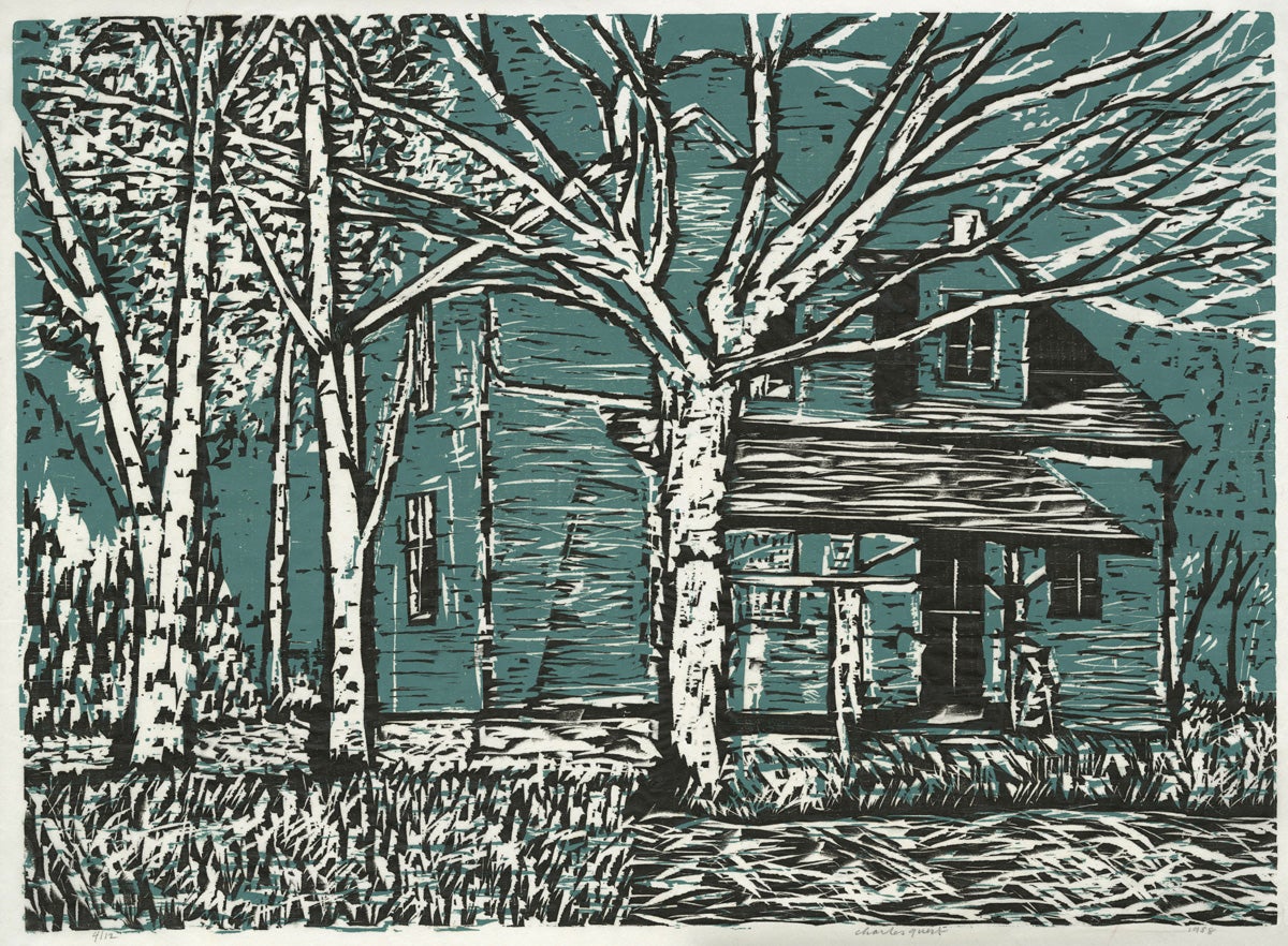
Old Farm House
Charles F. Quest (1904 - 1993)
1958
Color woodcut
4/12
407 x 559 mm
Gift of the artist
####.1.3145
Painter and printmaker Charles Quest was a native of St. Louis, Missouri and studied at the Washington University School of Fine Arts where he later taught from 1944 to 1971. Quest participated in the New Deal government-sponsored programs of the Public Works of Art Project and the Works Progress Administration, and painted murals in several public buildings in his hometown. He learned the techniques of woodcut and engraving from published manuals around 1940 and was inspired by the German artists Max Beckmann and Werner Drewes, who also taught at the university in St. Louis. Quest’s two-color woodcut, an edition of only 12 impressions, is accompanied by the color block and the black line block which delineate the forms of the trees and house.
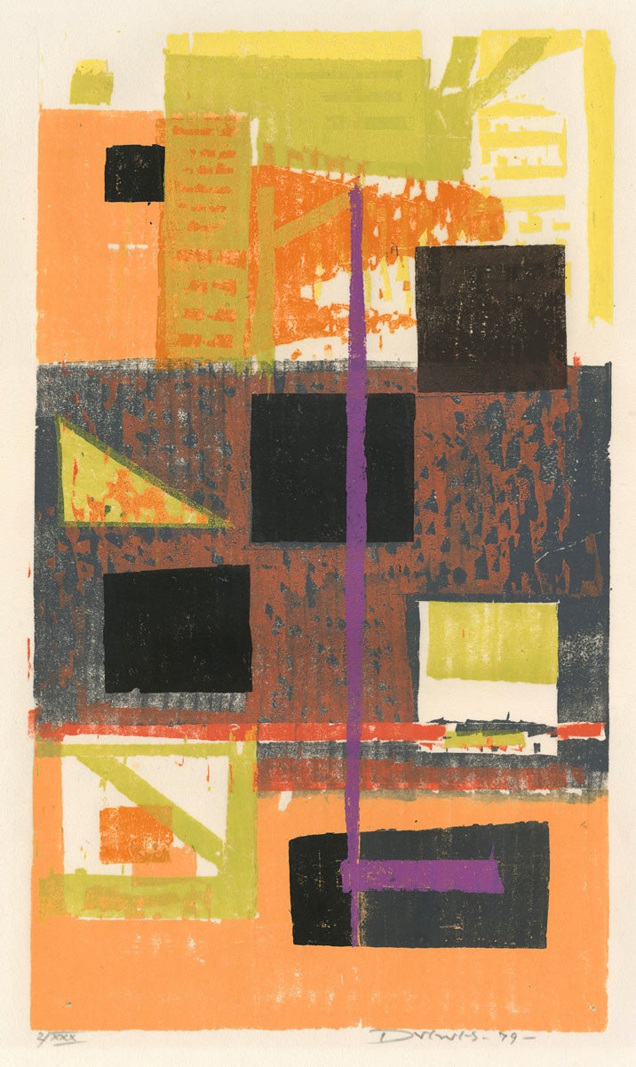
![Olive Trees [Miraflores, Lima]](/sites/default/files/1984.6.1.JPG)
Olive Trees [Miraflores, Lima]
Werner Drewes (1904 - 1993)
1960
Color woodcut
2/XXX
345 x 405 mm
Art Collection Purchase
1984.6.1
Werner Drewes was born in the Brandenburg region of north-east Germany and had a long career in the United States as an abstract painter and printmaker of color woodcuts. At the Bauhaus school of avant-garde art and architecture he studied printmaking with Lyonel Feininger, and after a brief hiatus in America, painting with Wassily Kandinsky, who remained a strong influence in his later work. In 1930 Drewes immigrated to the United States and almost immediately helped found the New York-based organization of American Abstract Artists. For almost twenty years he taught at the Washington University in St. Louis, Missouri, where he became friends with fellow printmaker Charles Quest, shown above.
American Abstract Artists

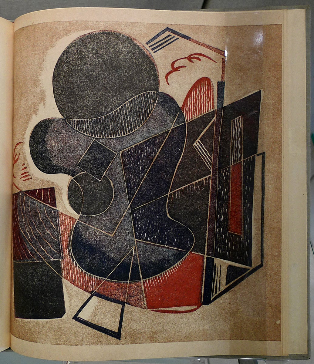
Ujon's Journey
Seong Moy (1921 - 2013)
1961
Color woodcut
84/100
284 x 382 mm
Art Collection Purchase
1990.24.3.7
In what might be the most technically complicated print in the exhibition, Moy uses eight colors in a very painterly way to express action and purpose.
Flight
Werner Drewes (1899 - 1985)
1982
Color woodcut
16/25
231 x 514 mm
Art Collection Purchase
2002.8.7
Werner Drewes was a founding member of American Abstract Artists, to which Louis Schanker and Jon von Wicht (below) also belonged. These artists are also connected, along with Milton Avery (above) by their participation in the New Deal Federal art programs of the 1930s.
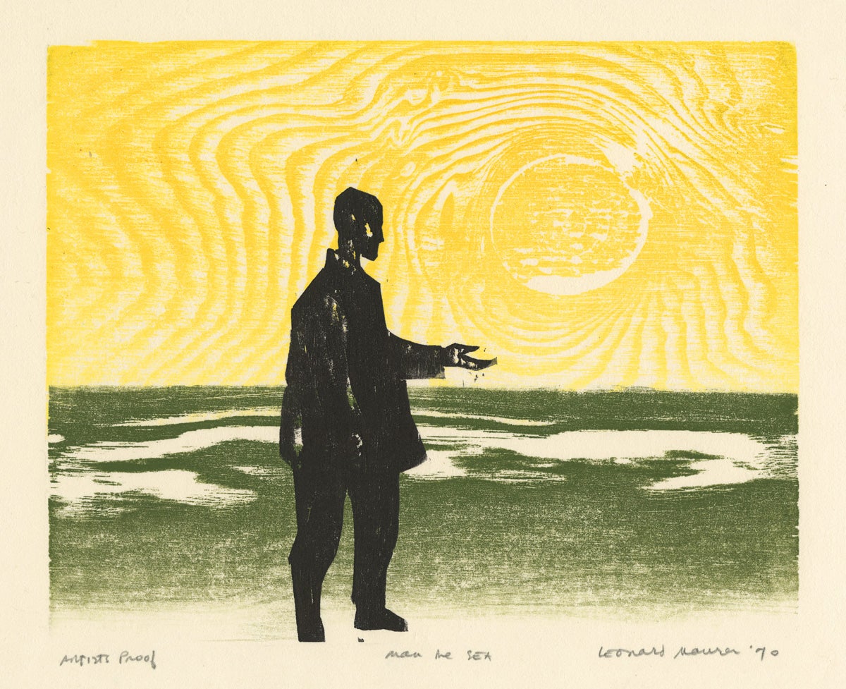
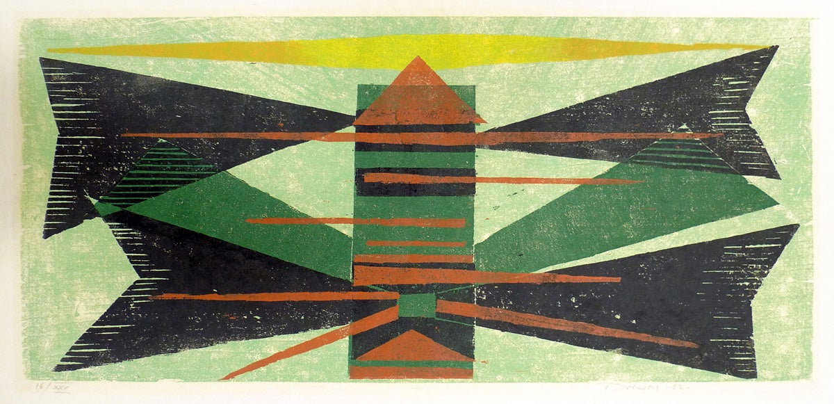
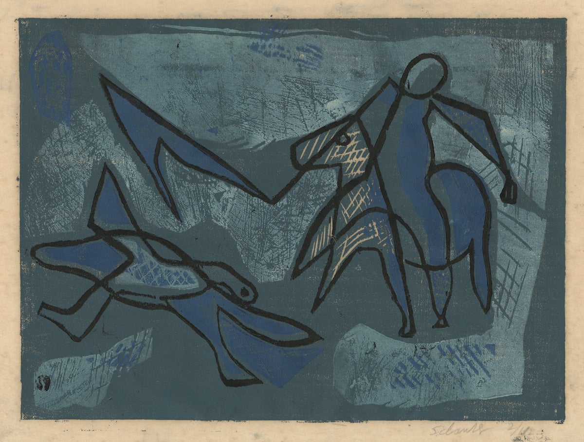
Man and the Sea
Leonard Maurer (1912 - 1976)
1970
Color woodcut
A/P
201 x 250 mm
Art Collection Purchase
2001.3.21
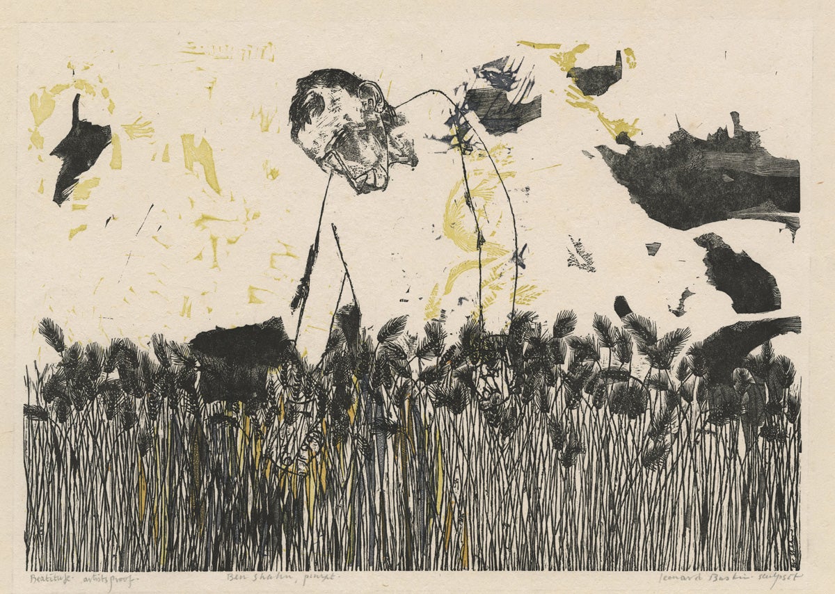
Beatitude
Leonard Baskin (1922 - 2000)
after a painting by Ben Shahn (1898 - 1969)
1954
Wood engraving
A/P
271 x 395 mm
Gift of Jay Finkel
2014.10.3
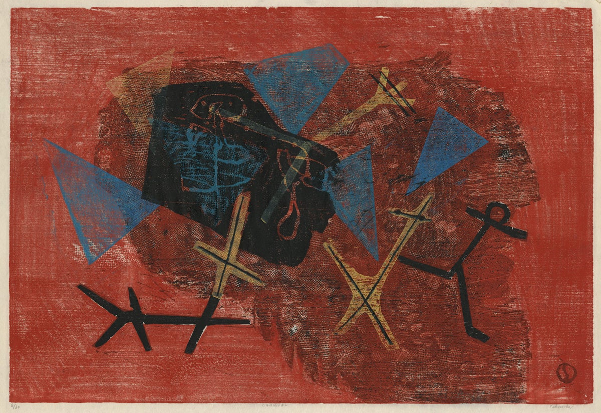
Carnival
Louis Schanker (1903 - 1981)
1948
Color woodcut
6/30
363 x 536 mm
Art Collection Purchase
1981.4.5
Schanker’s abstract works were better-received than others’ in the 1930s, perhaps because they (like the artist himself) retained a healthy dose of lightheartedness.

Abstractions
Charles William Smith (1893 - 1987)
1939
Color woodcut
212 x 218 mm
Art Collection Purchase
1987.20.1
St. George and the Dragon
Louis Schanker (1903 - 1981)
1941
Color woodcut
2/10
216 x 306 mm
Art Collection Purchase
1979.3.7
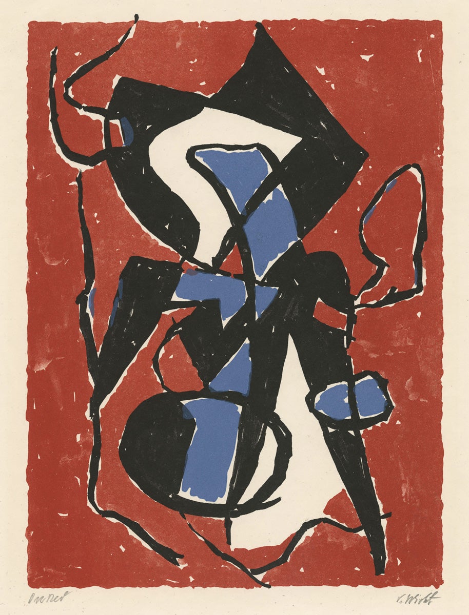
On Red
John von Wicht (1888 - 1970)
ca. 1957
Color woodcut
ed. 100
249 x 182 mm
Art Collection Purchase
1979.4.2
Abstraction
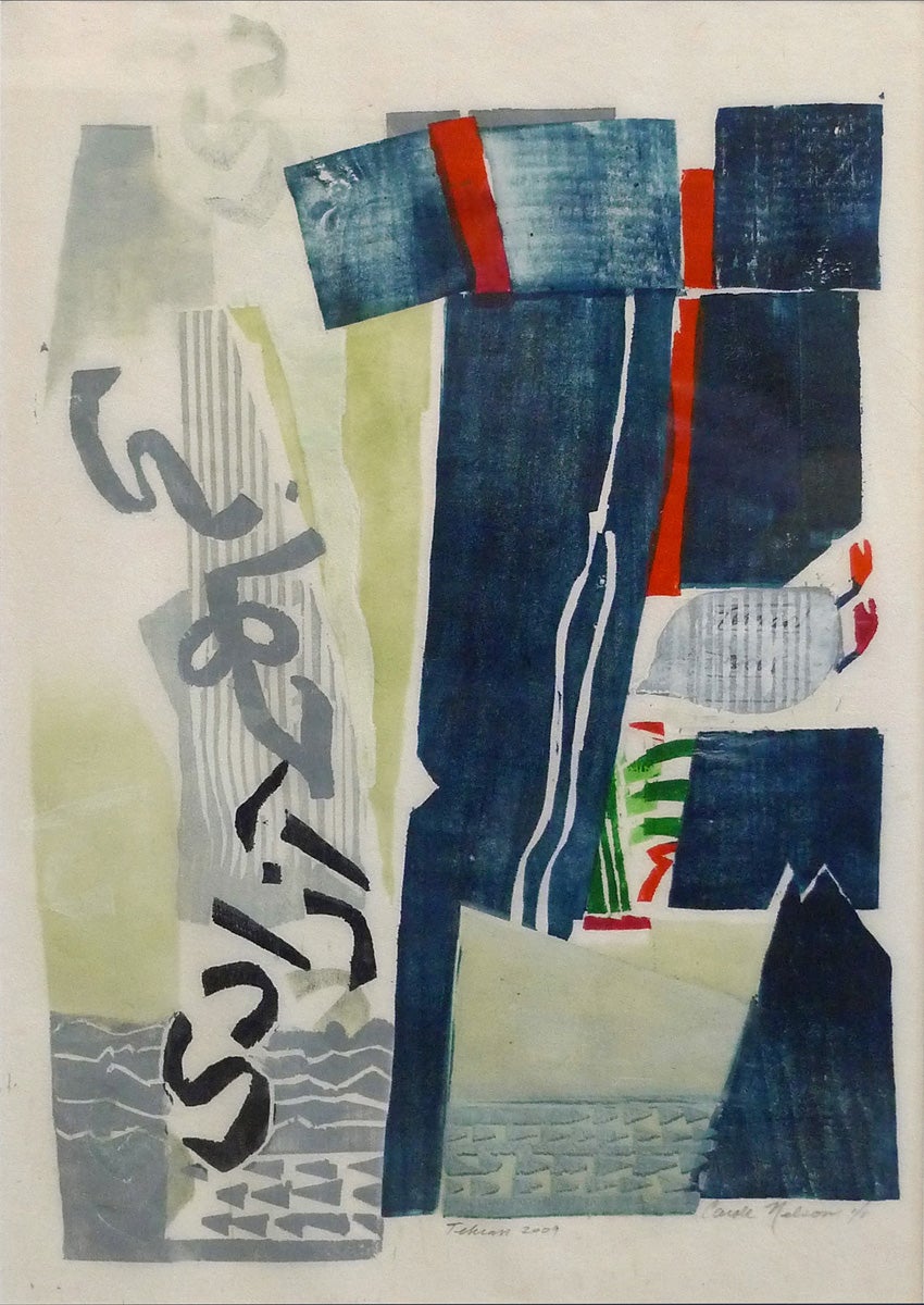
Tehran
Carole Nelson
2009
Color woodcut
1/1
On loan from the collection of Ingrid Rose
L.2016.2.1
Nelson lived in Shiraz, Iran for a time in the late 1960s. After visiting again in 2004, she began a series of prints exploring her memories and reflecting upon change. Tehran 2009 is a declaration of affection for the city, in the face of deep political unrest.
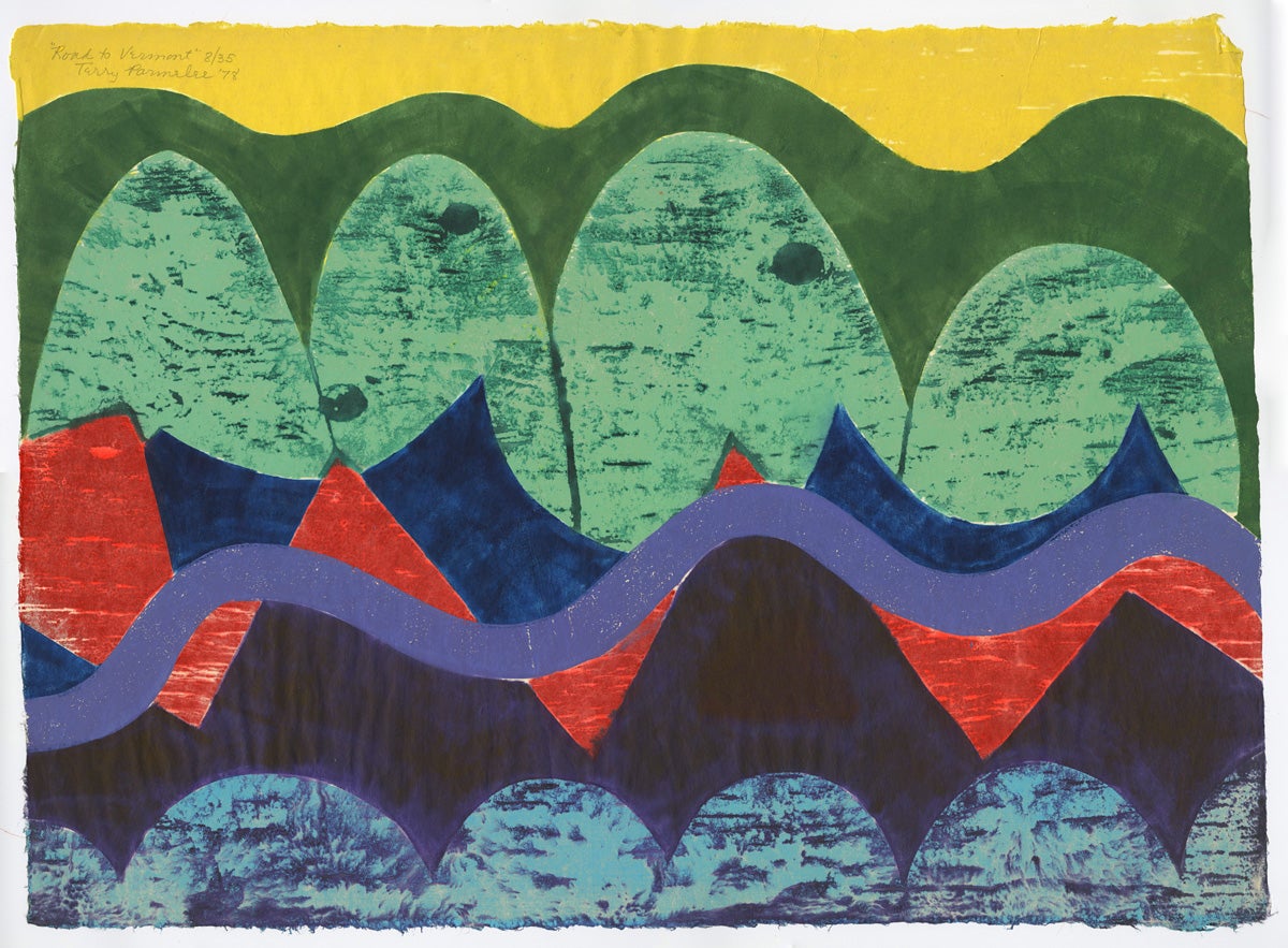
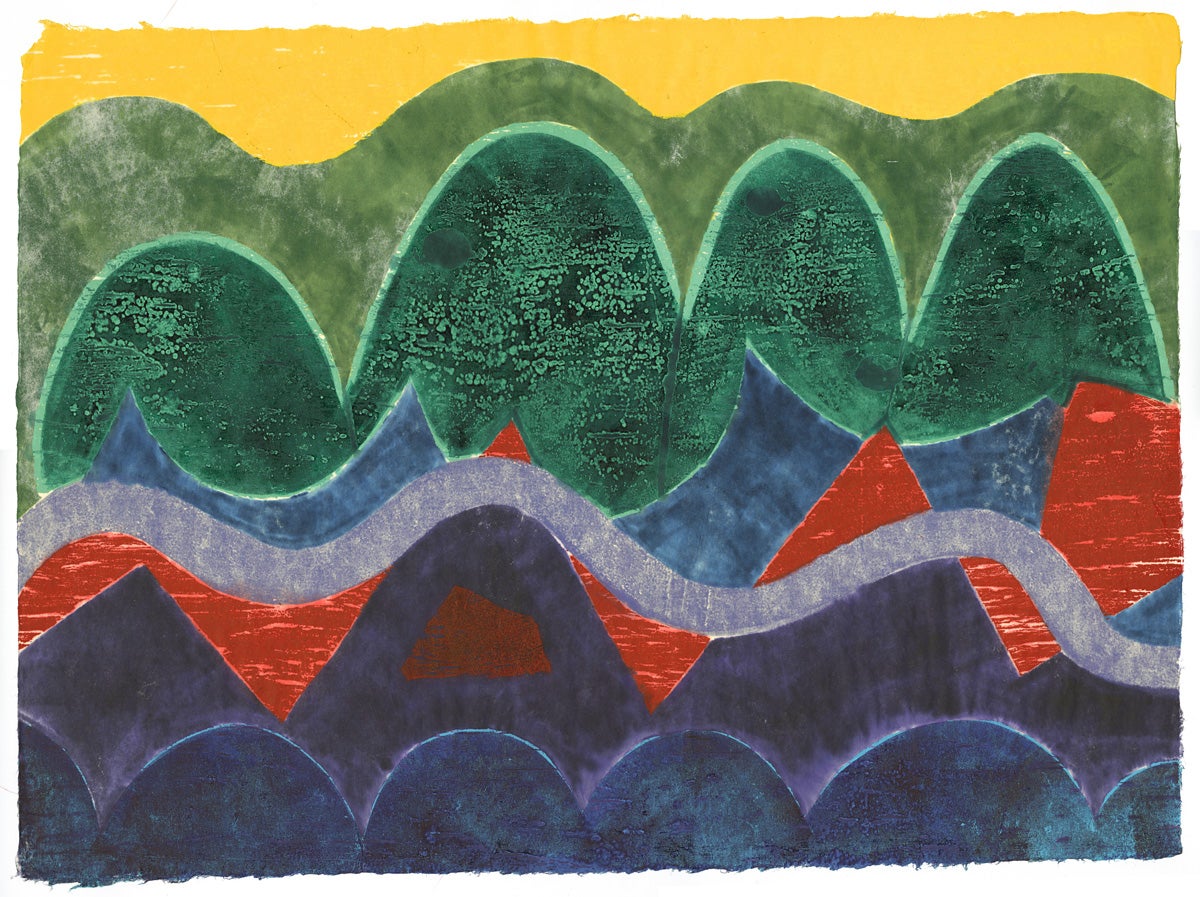
Road to Vermont
Terry Parmelee (b. 1929)
1978
Color woodcut
8/35
560 x 764 mm
Art Collection Purchase
1998.15.5
Parmelee, who studied with Hiratsuka and with Carol Summers, makes use of the dye technique pioneered by Summers (below) to create color that sinks into the paper to various degrees. Comparing the front of the print (left image) with the reverse (right image) shows the difference between the beginning and the end of the ink-layering process.
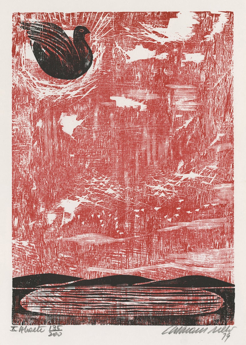
Untitled page from Abaeté: Dez Xilogravuras de Calasans Neto
Calasans Neto (1932 - 2006)
1979
Color woodcut
350 x 247 mm
Art Collection Purchase
####.1.6244.12
A roiling sky is rendered in red over gouges and scratches on coarse plywood, belying the still pond below. Compare to Maurer’s clever use of wood grain (above).
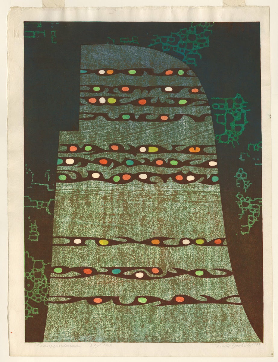
Transcendence
Yoshida Toshi (1911 - 1995)
1968
Color woodcut
39/120
498 x 367 mm
Art Collection Purchase
1995.8.22
Yoshida Toshi trained under his father Yoshida Hiroshi, one of the greatest artists of the traditional-revival shin-hanga movement. After the death of his father Yoshida came into his own artistically, exploring abstraction and joining the sôsaku-hanga movement.
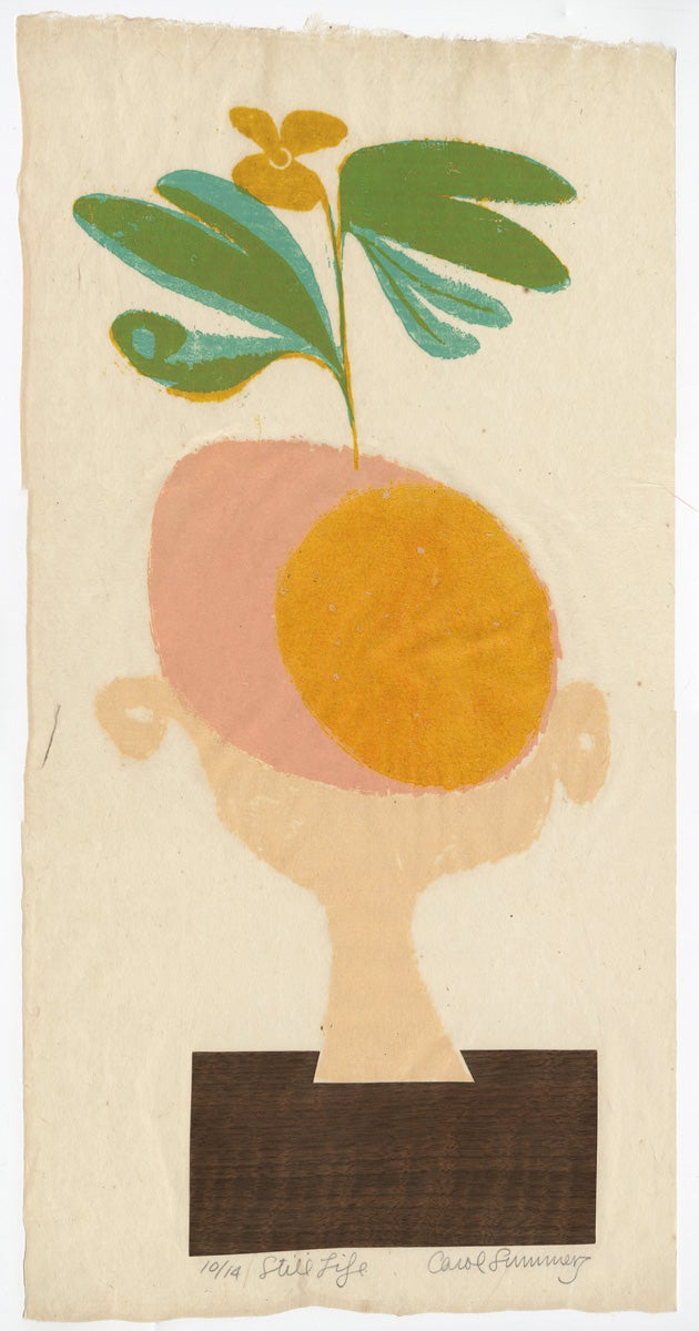
Still Life
Carol Summers (b. 1925)
1953
Color woodcut and collage
10/14
558 x 245 mm
Gift of the Lyon Estate
####.1.2141
Ascending Movement
Werner Drewes (1899 - 1985)
1979
Color woodcut
2/XXX
402 x 233 mm
Gift of Wolfram Drewes
1995.22.8
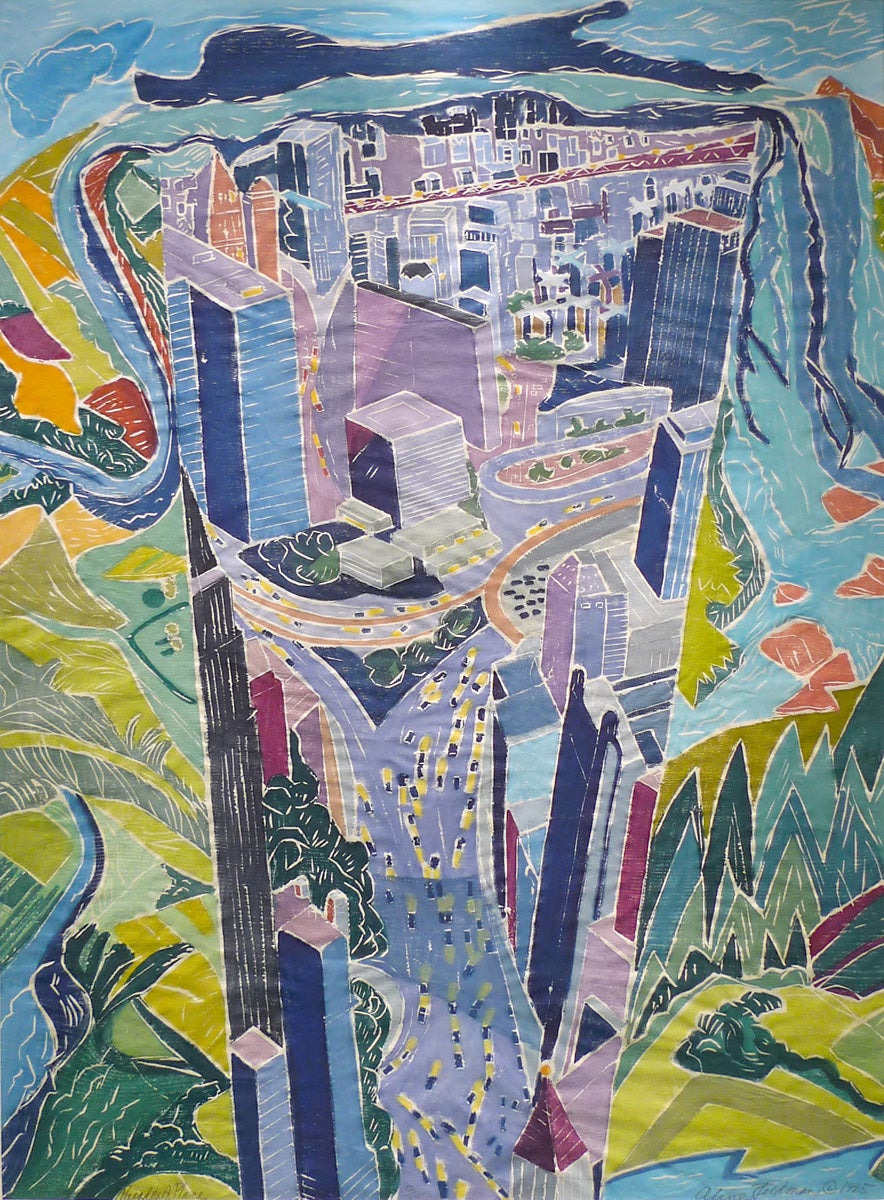
Paradox of Place
Aline Feldman (b. 1928)
1995
Color woodcut
12/25
803 x 585 mm
Gift of the artist for the Washington Print Club Collection
####.333.1
Feldman’s work is a synthesis of Eastern and Western printmaking techniques; she studied with masters of both traditions: Drewes, Hiratsuka, and Moy, among others. Using the chiaroscuro white-line approach, she paints ink onto the block and rubs the paper by hand to make an impression, but she uses only one block for all colors. Each area of the block is inked then rubbed onto paper bit by bit and colors are built up, producing woodcuts that are a hybrid of printing and painting.
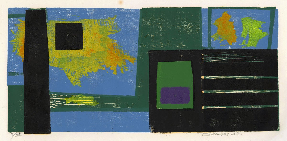
Escape
Werner Drewes (1899 - 1985)
1975
Color woodcut
16/XX
233 x 510 mm
Gift of Wolfram Drewes
1995.22.6
We would like to thank the following individuals for their time, assistance, and generous support with this exhibition:
Deniz Citak (SFS’17) Web site production
Stephen Fernie, Web site production
David Hagen, Graphics production
Stephanie Hughes, Web site production
Rev. Leon Hooper, S.J., Woodstock Theological Library Loan
Stefania Lazar, (C’18) Exhibition preparation
Karen O’Connell, Preservation
Ingrid Rose, Donor and Lender
Karen Seibert of the Drewes Estate; DrewesFineArt.com
The co-curators of this exhibition are: Christen Runge and LuLen Walker
Color in Relief is organized in conjunction with the Werner Drewes exhibition at the Washington Printmakers Gallery in Georgetown, November 2-26th. http://washingtonprintmakers.com/
Copyright for all images on this Web site is retained by the individual artists or their estates. Requests for reproduction permissions may be sent to: artcollection@georgetown.edu