INTRODUCTION: AMERICAN PRINTMAKING
American printmaking began to flourish in the late nineteenth century when American artists took an interest in etching. Intrigued by the spontaneous handling of line afforded by the technique, they were part of a wider Etching Revival that was taking place in England and France. The spread of the popularity of printmaking in America was aided by the establishment of print clubs. After a lull in the popularity of printmaking around the turn of the century, it reemerged in the early twentieth century with artists willing to experiment with diverse forms and techniques. During the 1930s and 1940s, printmaking in America incorporated the growing influences of contemporary European art. Beginning in the 1960s American printmaking was marked by the growth of workshops that allowed contemporary artists to collaborate with master printmakers on the creation of prints, specifically lithographs and silkscreens. The resulting prints appealed to audiences already familiar with the artists’ works in other media.
Drawn from the fine print holdings of Lauinger Library’s Special Collections Research Center, this exhibition represents the culmination of Professor Elizabeth Prelinger’s Art History 457 seminar on Twentieth Century American Prints in collaboration with Art Curator LuLen Walker of Special Collections. Students from Prof. Prelinger’s seminar selected representative examples of prints from each of the 7 categories outlined in the exhibition, and wrote all of the corresponding text labels. The Library’s collection, which totals over 12,000 fine prints, was formed by the tireless efforts and expert eye of Curator Emeritus Joseph A. Haller, S.J., who began to establish a teaching and research collection at Georgetown when he retired from the post of University Treasurer in the mid-1970s. It is to Father Haller that this exhibition is respectfully dedicated.
WHAT IS A PRINT?
The defining characteristic of a print is that it is made by a process that allows the creation of multiple copies of the same image. In order for the image to be reproduced, the artist creates a matrix—most often of stone, wood or metal—from which the image can be printed. A printed image is always a reversal, or mirror image, of the original design. The pulling of printed impressions from a matrix can be a highly technical process; therefore, some artists rely on a master printer to complete this part of the printmaking process.
Since the end of the nineteenth century, prints have often been made in editions which comprise a set number of impressions pulled from a matrix. The concept of editions arose as a means of increasing a print’s value by limiting the number created and guaranteeing the quality. Once an edition has been printed, plates or stones are often cancelled in order to ensure that no more prints are made from them. This can be done using such techniques as scratching the image out, punching holes in the plate, or grinding away the image from a lithographic stone.
WHY PRINTS?
Prints have been used to bring low-cost imagery to a wide audience and to promulgate ideas, propaganda and advertising while offering an opportunity for more intimate contact with a work on paper. Thus, prints differ from paintings, which are unique objects, which are usually more expensive and which do not allow the same intimate relationship between the viewer and the work. In addition, the multiplicity of prints allows for a far wider range of uses including such things as book illustrations, advertisements and political posters.
PRINTMAKING TECHNIQUES
Planographic
Lithography is a technique based on the fact that water and grease repel each other. The artist starts with a smooth surface of a stone, generally limestone. The artist draws the image directly onto the surface. There are numerous materials that can be used like litho crayons and grease pencils. After the image is complete, the artist or printer prepares the stone. This involves a process of fixing the image or “etching” it on the stone. The printer does this with by treating the surface with a combination of nitric acid and gum arabic. Then the printer wets the stone with a sponge. The grease of the image repels the water so only the blank areas retain water. When the printer rolls the ink onto the image the ink adheres only to the grease marks on the stone, that is, the drawn image. The stone is then placed flat on a scraper press that runs horizontally along the back of the paper. The pressure transfers the ink from the stone to the paper. The stone must be rewet and inked before each print.
A modern development of this process is offset lithography. The image is prepared in the same way but the printing method is different. The image drawn on a plate is run under a roller. The roller picks up the ink and then rolls across the paper to transfer the image. This process is fast and efficient, and is used in standard commercial runs of lithographic prints.
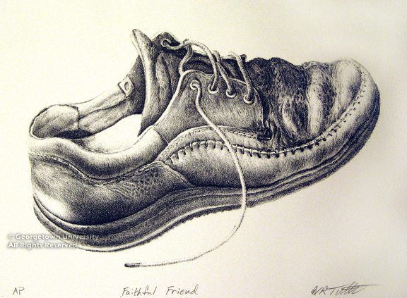
Faithful Friend
William Tuthill
2007
Lithograph
165 x 245 mm
Planographic
Lithography is a technique based on the fact that water and grease repel each other. The artist starts with a smooth surface of a stone, generally limestone. The artist draws the image directly onto the surface. There are numerous materials that can be used like litho crayons and grease pencils. After the image is complete, the artist or printer prepares the stone. This involves a process of fixing the image or “etching” it on the stone. The printer does this with by treating the surface with a combination of nitric acid and gum arabic. Then the printer wets the stone with a sponge. The grease of the image repels the water so only the blank areas retain water. When the printer rolls the ink onto the image the ink adheres only to the grease marks on the stone, that is, the drawn image. The stone is then placed flat on a scraper press that runs horizontally along the back of the paper. The pressure transfers the ink from the stone to the paper. The stone must be rewet and inked before each print.
A modern development of this process is offset lithography. The image is prepared in the same way but the printing method is different. The image drawn on a plate is run under a roller. The roller picks up the ink and then rolls across the paper to transfer the image. This process is fast and efficient, and is used in standard commercial runs of lithographic prints.
Relief
Relief prints are prints in which the image to be printed is raised above the rest of the block, which the artist has cut away. The principal relief techniques are woodcut, wood-engraving, and linocut. Various tools, including knives, chisels, and gouges, can be used to carve away the areas to create the image. Once the artist creates the raised lines, the ink is applied to the top surface only. All the areas that have been carved away do not receive ink and therefore do not print in the resulting image. Some artists use a negative relief process, in which the lines are carved away and when printed, do not register because they are below the surface. Relief printing ink is very thick so it will not drip down into the carved areas. To print a relief image, paper is laid across the inked block and a press applies vertical pressure. Instead of using a press, one can also use the block as a stamp, or rub the back of the paper to transfer the image.
Woodcut starts with a wood block cut from the side plank of a tree. The artist carves along the grain of the wood with a knife, chisels and gouges. Close parallel lines or cross-hatching creates shading and tonal areas.
Instead of a side plank of wood, wood-engravers use the cross section, or end-grain, of a piece of wood, which is much finer and harder. The artist cuts across the grain and not with the grain. The stronger, harder section allows the artist to make more intricate and detailed lines than are possible with a woodcut. Because of the smaller, more detailed lines, wood engravings can capture tonal qualities more easily than woodblock prints.
Linocut is a newer type of relief print. The key difference is that the artist cuts the image into linoleum instead of wood. Linoleum is much more flexible and softer than wood, making it very easy to cut. Because of the lack of grain, it is easier for artists to achieve smooth, solid areas of color. This method is often used in printing classes to introduce students to relief printmaking.
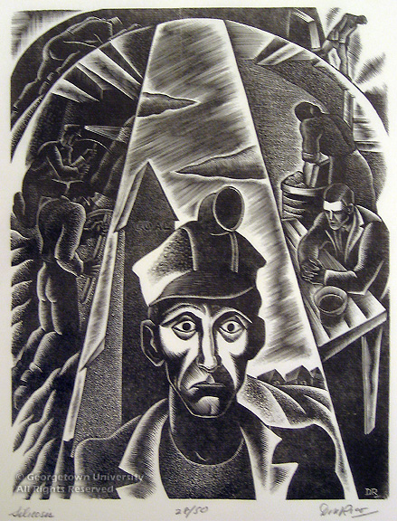
Industrial Disease #1 : Silicosis
Don Rico (1912-1985)
1933
Wood engraving
201 x 152 mm
Library Purchase 1986
1986.12.3
Don Rico began his career in wood engraving during the Great Depression, working for the WPA Federal Arts Project. Industrial Disease #1: Silicosis shows coal miners and tells of the dangers they face while on the job. Silicosis is a lung disease developed from breathing in silica dust found in coal and usually is only considered a work related disease. The bold lines underscore the tragic fate of these miners, who labor at low wages for decades in the depths of the earth. Their reward is an agonizing death.
Intaglio
Intaglio prints are created by incising lines into a metal plate, historically copper, but more recently, zinc. After creating the lines, the plate is inked and then wiped clean to remove all excess ink from the surface, leaving only the ink inside the grooves of the lines. The printer lays a sheet of dampened paper over the plate and runs both through the press. The extreme pressure forces the paper into the lines where it picks up the ink, thus creating the image. Some different intaglio techniques include engraving, etching, mezzotint, aquatint, and drypoint. Each technique is printed the same but the way the lines are created on the plate is different.
For engraving, the oldest of the intaglio methods, the artist uses a tool called a burin, or graver, and creates the lines by incising directly into the plate.
Etching begins with an etcher covering the plate with an acid resistant ground material. Using an etching needle, the artist scratches lines into the ground material to expose the metal plate. When placed into an acid bath, only the exposed metal is “bitten” away. The longer the bite, the deeper the line will become, the more ink it will hold, and the darker it will print. The plate is then printed as described above.
To make a mezzotint, the artist works from dark to light, creating a tonal image. The entire surface of the plate is covered by densely overlapping indentations, using a tool called a rocker. The more indentations created on the plate, the more solidly black the plate will print. From there the artist takes a burnishing tool and smoothes away the sections of the plate that are intended to be areas of light. Mezzotints images are tonal rather than linear and were traditionally used to reproduce paintings.
Aquatint is also a tonal process of intaglio printing. Acid-resistant fine powder is dusted on areas of the plate where the image requires tonal effects. The acid then bites into the tiny intervals between the aquatint particles. When inked, the aquatinted areas create shaded passages. Artists often repeat this technique several times to create layered tonal effects. The artist may often combine aquatint with another technique to make an image both with tonal areas and with lines from another process.
Drypoint is similar to the engraving process in that lines are incised directly into the plate. The artist uses a tool called a drypoint needle. When the needle is pushed through the metal plate, it leaves raised metal edges called the “burr.” An engraver sands away the burr for a clean line. But for a drypoint, the burr is left on the plate. When the plate is inked and wiped, extra ink remains in the burr, creating a dark, velvety texture. Many fewer impressions can be pulled from a drypoint plate since the burr wears down more quickly than the rest of the plate under the pressure of the printing press.
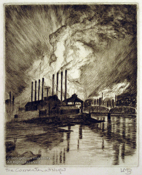
The Converter at Night
Louise Boyer Miller (1890-1976)
ca. 1940
Drypoint
213 x 138 mm
Gift of Helen Boyer
1988.34.8
Intaglio prints are created by incising lines into a metal plate, historically copper, but more recently, zinc. After creating the lines, the plate is inked and then wiped clean to remove all excess ink from the surface, leaving only the ink inside the grooves of the lines. The printer lays a sheet of dampened paper over the plate and runs both through the press. The extreme pressure forces the paper into the lines where it picks up the ink, thus creating the image. Some different intaglio techniques include engraving, etching, mezzotint, aquatint, and drypoint. Each technique is printed the same but the way the lines are created on the plate is different. For engraving, the oldest of the intaglio methods, the artist uses a tool called a burin, or graver, and creates the lines by incising directly into the plate. Etching begins with an etcher covering the plate with an acid resistant ground material. Using an etching needle, the artist scratches lines into the ground material to expose the metal plate. When placed into an acid bath, only the exposed metal is “bitten” away. The longer the bite, the deeper the line will become, the more ink it will hold, and the darker it will print. The plate is then printed as described above. To make a mezzotint, the artist works from dark to light, creating a tonal image. The entire surface of the plate is covered by densely overlapping indentations, using a tool called a rocker. The more indentations created on the plate, the more solidly black the plate will print. From there the artist takes a burnishing tool and smoothes away the sections of the plate that are intended to be areas of light. Mezzotints images are tonal rather than linear and were traditionally used to reproduce paintings. Aquatint is also a tonal process of intaglio printing. Acid-resistant fine powder is dusted on areas of the plate where the image requires tonal effects. The acid then bites into the tiny intervals between the aquatint particles. When inked, the aquatinted areas create shaded passages. Artists often repeat this technique several times to create layered tonal effects. The artist may often combine aquatint with another technique to make an image both with tonal areas and with lines from another process. Drypoint is similar to the engraving process in that lines are incised directly into the plate. The artist uses a tool called a drypoint needle. When the needle is pushed through the metal plate, it leaves raised metal edges called the “burr.” An engraver sands away the burr for a clean line. But for a drypoint, the burr is left on the plate. When the plate is inked and wiped, extra ink remains in the burr, creating a dark, velvety texture. Many fewer impressions can be pulled from a drypoint plate since the burr wears down more quickly than the rest of the plate under the pressure of the printing press. The Converter at Night shows a steel mill in Pittsburgh in the early 1930s. Here, the monumental Bessemer Converter turns iron into steel in a process made even more dramatic in a night scene. Boyer created this drypoint on a treated aluminum plate, instead of the more common copper or zinc. She began experimenting with aluminum plates after Alcoa opened a Pittsburgh mill in 1931. Boyer was born and raised in Pittsburgh along the Monongahela River. Many of her works depict the laborers and mills along the riverside and explore the social and environmental impact of industry. The two diagonal lines seen on the top right and bottom left of the plate are cancellation marks, made by the artist or printer when the edition was complete; these marks prevent additional, unauthorized impressions from being pulled from the plate.
JOSEPH PENNELL
The “dean” of American printmaking, Joseph Pennell became interested in the graphic arts early in his lifetime; at the age of twenty, he co-founded the Philadelphia Society of Etchers and supported young printmakers long into the twentieth century. Cosmopolitan and curious, Pennell documented his many experiences in Europe and the Americas. Having already ventured down to make etchings of the construction of the Panama Canal, he served on the print jury for the Panama-Pacific International Exhibition in San Francisco in 1915. The artist, along with his wife Elizabeth Robins Pennell, published various books on the graphic arts, each advocating a different printmaking medium, including Lithography and Lithographers, 1898. In 1922, Pennell took charge of the etching program at the Art Students League in New York. His commitment to printmaking continues through the Pennell Fund, which allows the Library of Congress Division of Graphic Arts to purchase original prints.
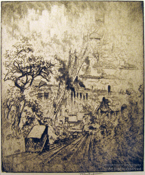
Riverside Station, Pittsburgh
Joseph Pennell (1857-1926)
1919
Etching
300 x 252 mm
Library Purchase 2001
2001.7.6
From atop the Duquesne Incline, or funicular, the early morning hustle and bustle of Pittsburgh unfolds beneath the viewer. Pennell captured the industrial nature of this city with its smokestacks, railroads, and the Ohio River. The artist compared this modern technological scene to the natural grandeur of the Alps emerging from the mist at dawn, commenting: “One is as fine as the other.” Visible in this image are the various tones Pennell created with selective wiping of the plate, as in the upper right corner, and his expressive use of line, as seen in the silhouette of the skyline. A staunch advocate of the intaglio media, Pennell believed that, “the great etchers have suggested more colour, tone, and values with a few lines,” than others could with many more varied techniques.

Union Square
Joseph Pennell (1857-1926)
1904
Lithograph, ed. 100
269 x 160 mm
Library Purchase 2001
2001.17.2
Tenth in a set of images of twelve New York landmarks making up the “Iconophiles” set, sponsored by “The Society of Iconophiles,” this transfer lithograph of Union Square joins Battery Park, the Times Building, the Stock Exchange, Pine, Williams and Nassau Streets, Broadway, Broadway Towers, and the Flatiron Building. Pennell’s elevated vantage point structures our gaze downwards as if from a skyscraper. The technique of transfer lithography involves first sketching the image on special transfer paper directly in front of the subject before handing the sheet to a master printer for transferral to a lithographic stone and printing up. Here, a pattern of dots, possibly reflecting the texture of the paper, forms the trees, figures, and buildings. Pennell’s earlier travels to Venice taught him to draw the fine filigree that marks the Square’s entrance as well as the top of the former Decker Building, which anchors the Square, and later in the century housed Andy Warhol’s “Factory.”
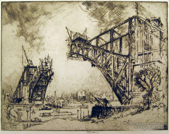
Bridge at Hell Gate
Joseph Pennell (1857-1926)
1915
Etching
213 x 276 mm
Library Purchase 1998
1998.8.4
The two hulking towers of the Bridge at Hell Gate rise over the East River to form the central compositional element of this etching. Construction was still underway on this arch span when Pennell depicted it in 1915. The 3.2 mile- long viaduct, completed the following year, was designed for a four-track railway accommodating fast trains from Boston to New York. Pennell was inspired by monumental technological projects; he made a special trip to observe the construction of the Panama Canal. In this etching, he deliberately bit the lines very deeply in order to convey a vivid impression of the engineering machinery used to construct this bridge, the longest steel-arch span in the world.
THE MODERN CITY
At the turn of the century, American printmakers began to look at their home cities with new interest. Unencumbered by the historical legacy of their European counterparts, American cities were free to experiment with innovative architecture and planning. New York, in particular, was a center of activity. Driven by wealth and ambition, business enterprises scrambled to establish themselves in Manhattan. Built in 1913, the fifty-story Woolworth Building housed 400 different companies, and the seventy-seven story Chrysler building was out-built almost immediately by the Empire State Building. The skyscraper, a marvel of technological innovation, became the new icon of modernity in America.
Radio City
Leon Louis Dolice (1892-1960)
ca. 1934
Color linocut
352 x 228 mm
Library Purchase 1997
1997.5.1
Leon Louis Dolice moved to New York City from Europe in the 1920s. His new home became the subject of most of his work. Radio City captures the grandeur and energy of the rapidly evolving city. The heavy black lines of the key, or drawing, block emphasize the streamlined geometry of the building, as opposed to the intricate decoration of the church and the tangled branches of the foreground tree. The towering Radio City Music Hall remains the largest indoor theater in the world; when it opened in 1932 it was considered the epitome of modernity with its sleek lines and Art Deco interior designs.
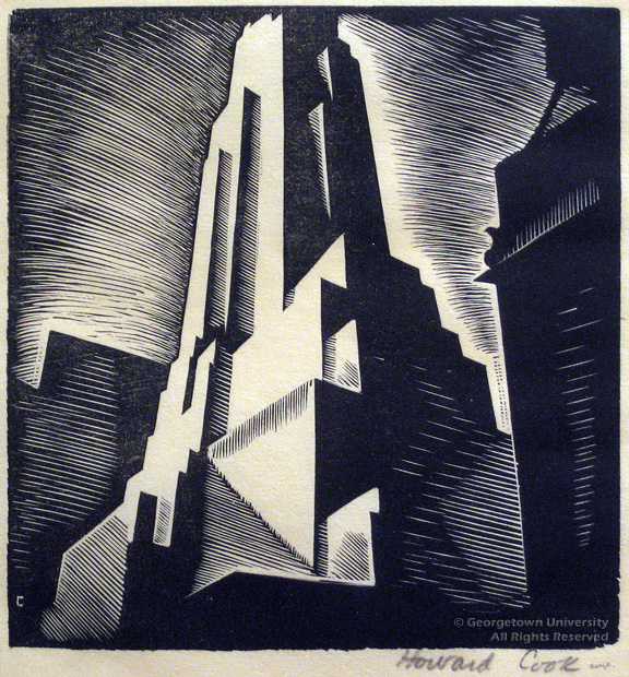
Skyscraper #1
Howard Norton Cook (1901-1980)
1928
Wood engraving
81 x 76 mm
Library Purchase
1111.1.1753
Howard Cook watched as the skyline of New York City grew. He captured the immense forms and moody presence of these modern monuments in such prints as Skyscraper #1. Beginning his career as an illustrator for magazines such as Forum and Harpers, Cook eventually arrived in New York City. Although this wood engraving is only three inches square, it captures both the grandeur and the slightly menacing presence of this building. Unlike many of the architectural prints of other American printmakers, Cook presents a symbolic and mysterious (as opposed to a realistic) rendering of the metropolis. With its oblique angles and velvety blacks, the skyscraper dwarfs the surrounding buildings. The atmospheric tones created with the horizontal back-and-forth motion of the wood-engraver’s tool lend depth to the starkly contrasting blacks and whites, creating an aura of foreboding.
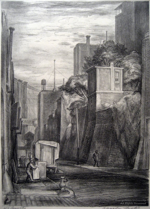
Brooklyn Heights : The Old Street
Charles Wheeler Locke (1899-1983)
ca. 1930
Lithograph
291 x 205 mm
Library Purchase 1982
1982.6.12
Charles Wheeler Locke is best known for his lithographs of the docks, wharves and streets of New York City. In this image, what seems a nostalgic view of South Furman Street in Brooklyn is actually a modern scene. The darker lithographic crayon lines in the foreground lead the viewer from the figures on the sidewalks back to the Brooklyn Bridge in the distance. Unlike the typically celebratory depictions of this modern technological wonder, completed in 1883, this image provides only a tantalizing glimpse of its delicate cables. Rather, Locke realizes that life continues as usual on this “old” street despite the monumental changes that are taking place nearby.
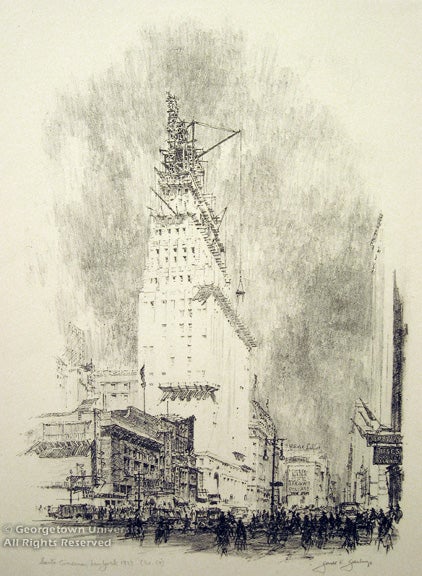
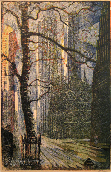
Santa Cinema
Gerald K. Geerlings (1897- 1998)
1927
Lithograph
290 x 225 mm
Gift of David Allen
1995.6.1
After serving in the First World War Geerlings attended the School of Architecture at the University of Pennsylvania and then turned to printmaking. In this 1927 lithograph entitled Santa Cinema, Geerlings presents a documentary image of the burgeoning growth in New York City; here a towering New York skyscraper soars upwards as city life continues at street level. Working with a lithographic crayon, Geerlings contrasts the pristine white skyscraper, with its geometric shapes and planes, with the more organic forms of people in the street. The intricacy of the building machinery reveals Geerlings’s professional architectural training and a more positive outlook on technology than we discern in Cook’s image.
WORLD WAR I
The First World War (1914 – 1918) broke out in Europe in August of 1914. Sparked by the assassination of the Archduke of Austria-Hungary and his wife in Sarajevo, the War derived from untenable alliances among the European powers. The United States maintained a neutral and pacifist position until April of 1917, when President Woodrow Wilson asked Congress to declare war against Germany and Austria-Hungary. American citizens rallied to serve their country in a foreign war of unprecedented technical sophistication and ferocity. Prints, as an art form, became a crucial tool for propaganda and a method of conveying the realities of war to the American public. Both time and cost efficient, prints were easy to manufacture in large quantities and could be efficiently distributed throughout the country. Large color posters, produced by offset lithography and printed by the thousands, exhorted Americans to enlist, buy Liberty Bonds and conserve resources. War artists, either commissioned by the United States government or freelance, traveled to the trenches of Europe and recorded actual events. The preliminary drawings they produced were later recreated as prints and appeared in popular American publications. The works in this section are meant to display a variety of sentiments towards the war, including nationalism, patriotism, and disillusionment.
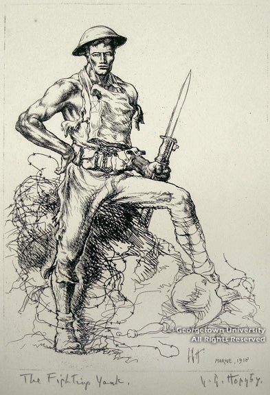
The Fighting Yank
Lester George Hornby (1882-1956)
1918
Etching
210 x 149 mm
Library Purchase 1986
1986.27.7
Lester Hornby, schooled in his home state of Massachusetts and abroad in Paris, was a war artist during World War I. Hornby was granted permission by General John Pershing in 1918 to spend six months on the battlefront documenting the American and French advances. Hornby etched this image during his time along the Marne and the Meuse. Exemplifying masculinity, an impossibly fit, sword-wielding soldier, posed on barbed wire, directs a cocky stare toward the viewer. His muscled arm and chiseled facial features epitomize the ideal World War I solider. At first glance, the image symbolizes the patriotic strength of the American military, though the figure stands in stark contrast to the actual experience of fatigued, starving soldiers. Erotic symbols abound in this none-too-subtle phallic representation, both in the erect weapon and the man’s arrogant stance. Hornby appears to mock the war through his satirical caricature.
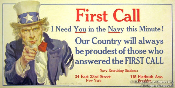
First Call
James Montgomery Flagg (1877-1960)
ca. 1918
Offset lithograph
243 x 496 mm
Gift of Roger N. Mohovich Collection
1997.44.154
James Montgomery Flagg’s poster, First Call, motivated American men to join the Navy in response to the United States’ declaration of war against Germany and Austria-Hungary. As an American illustrator and official military artist for the state of New York during World War I, Flagg produced forty-six different posters to promote enlistment. Printed in red, white and blue, First Call exemplifies patriotism through the use of a popular national symbol, the stern, white-maned Uncle Sam—none other than the artist’s self-portrait. The copyright date reveals that this poster was issued directly after the United States declared war. Recognizing the individual’s desires both to serve his country and to be recognized for his efforts, First Call represents the multiple motivations behind the decision to serve one’s country.
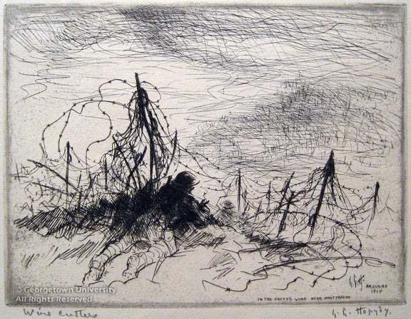
Wire Cutters
Lester George Hornby (1882- 1956)
1918
Etching
148 x 197 mm
Library Purchase 1986
1986.28.17
Aggressive etched lines capture a tense moment in combat, as soldiers lie prone before a tangled barbed wire fence aiming their weapons. The barbed wire barrier, omnipresent in World War I battlefield photographs, slashes the composition in half, creating zones of safety and danger. The image stands in stark contrast to Hornby’s Fighting Yank as it rejects an idealized representation of the American soldier. Loose strokes of the etching needle outline one soldier while thick cross-hatched lines delineate the others more fully. The sketchiness of the scene vividly suggests the brutal terror of war.
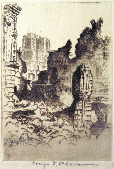
Ruins of Rheims
George Taylor Plowman (1869-1932)
ca. 1918
Etching
148 x 101 mm
Library Purchase 1989
1989.14.3
Minnesota-born George Plowman worked primarily as an architect throughout his career, but also specialized in architectural etching. During the War, he journeyed to France, where he etched this image. Remains of the westwork and spires of the cathedral Notre-Dame de Rheims, shelled by the Germans in 1914, tower above the ruins and rubble in the foreground. The destruction of Rheims, coronation church of the French kings for centuries, symbolized the utter senselessness and barbarity of the War and the devastating effects combat had on the cultural patrimony of Europe. As British politician Sir Edward Grey sadly noted at the time, “The lamps are going out all over Europe; we shall not see them lit again in our lifetime.”
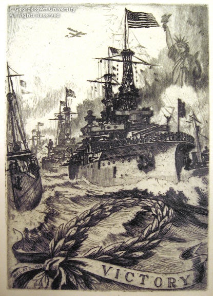
Victory
Charles F. W. Mielatz (1864-1919)
ca. 1934
Color linocut
352 x 228 mm
Library Purchase 1982
1982.8.9
Charles F. W. Mielatz’s etching, Victory, represents American pride upon the return of American battleships to New York Harbor at the end of World War I. Born in Germany, Mielatz taught etching at New York’s National Academy of Design. For Victory, unlike his other New York-themed images, the artist selected specific heroic monuments such as the Statue of Liberty as allegorical backdrops for a show of power, symbolized by the ships, airplane, and the laurel wreath. Rendered with intricate detail and exquisite control of the etching needle, this diminutive image expresses an unambiguous celebration of the successful conclusion of the most destructive war in history.
WPA (WORKS PROGRESS ADMINISTRATION)
The stock market crash of 1929 and the ensuing Great Depression profoundly affected American art and artists as the art market all but vanished under the failed economy. In 1932, newly elected president Franklin D. Roosevelt instituted his “New Deal” reform measures, intended to provide relief for the fourteen million unemployed Americans. The resulting Works Progress Administration (WPA) was designed to preserve the dignity of the workers by providing opportunities within their previous professions. For graphic artists, this primarily took the form of the Federal Art Project (FAP), established in 1935. The FAP artists depicted realistic murals of daily life on the numerous public buildings they were assigned to paint. Thomas Hart Benton, Grant Wood and other Regionalists influenced many FAP artists in their efforts to revive an American style and focus on the hardships of the “man on the street.” Artists emphasized social commentary in their art, a natural tendency since many artists shared the economic plight of the ordinary people they portrayed. Easel painters and print artists were given more freedom than mural painters with regard to technique and subject matter, and were free to experiment with new European styles and provocative themes.
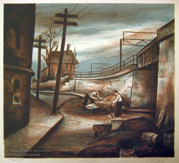
Underpass
Leonard Pytlak (1910-1998)
1939
Color lithograph
322 x 356 mm
Library Purchase 2007
2007.24.3
In 1938 Leonard Pytlak was assigned to the WPA/FAP seriography unit. In this New York City workshop Pytlak and many other project artists began to experiment with color lithography, such as his 1939 print Underpass. This darkly lit scene features two men laboring under an empty and desolate industrial roadway. Pytlak focuses here on an apparently ordinary Depression-era scene: two men load a wheelbarrow while a woman looks on indifferently from her window. Yet a sense of hopelessness pervades the image. Bleak industrial forms overshadow Pytlak’s figures, including the two large telephone poles towering precariously above. A simple shack flanked by the pointed branches of a barren and leafless tree completes this somber picture.
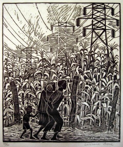
Land of plenty
Lucienne Bloch (1909- 1999)
ca. 1935
Woodcut
270 x 222 mm
Library Purchase 1989
1989.5.3
Swiss-born Lucienne Bloch joined the WPA as a painter of murals, working extensively with Mexican muralist Diego Rivera throughout the 1930s. The ironically titled 1935 woodblock print Land of Plenty reveals the artist’s preoccupation with the social and economic injustices of her era. Here, barbed wire separates a poverty stricken family from a field of towering stalks of corn and looming power lines. High tension electrical wires were still rare at the time; although the New Deal attempted to provide power to rural areas, many people were still too poor to afford electricity. The stalks of corn most likely refer to a program organized by the Agricultural Adjustment Administration, which paid farmers to destroy crops in order to raise prices. The intense contrasts between black and white characteristic of the woodcut medium comment on the race of the family as well as the paradox of a situation where people starve in the literal shadow of great abundance.
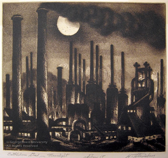
Bethlehem Steel in moonlight
Harry Sternberg (1904-2001)
1937
Etching; Aquatint
202 x 223 mm
Library Purchase 1981
1981.3.23
In Bethlehem Steel in Moonlight, Sternberg records a dramatic moment when the smoke stacks tower against the night sky. The aquatint creates a murky film on the surface of the print, which directly evokes the grittiness of the location. Sternberg underlines the sinister quality of the mills rather than glorifying them as symbols of progress and opportunity.
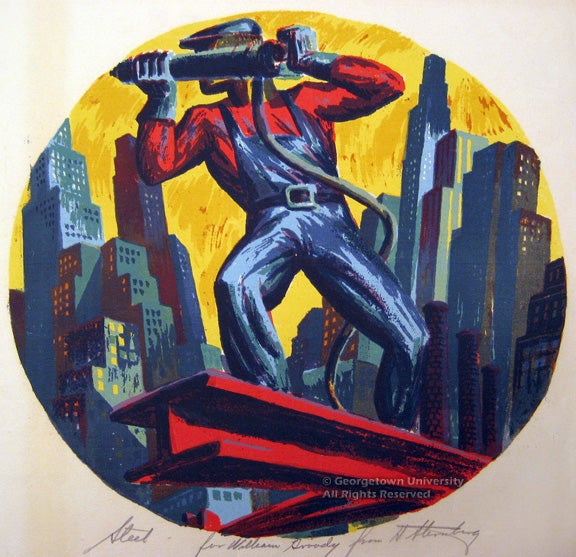
Steel (aka Riveter)
Harry Sternberg (1904-2001)
1935
Serigraph
288 x 288 mm
Library Purchase 1980
1980.1.18
Harry Sternberg began his WPA career in 1935 when he became a technical advisor to the Graphic Arts division of the Federal Arts Project (FAP). Sternberg specifically chose to make prints because of their technical versatility, and he left no print technique untried. In 1936, a Guggenheim Fellowship allowed him to study the conditions of the workers in coal mines and steel mills. In this aquatint, Sternberg encased a hulking figure in a circular format from a perspective that guides our gaze upwards in awe. The sharp edged forms, typical of the stenciled screen-printing technique, lend a sculpted quality to the figure. Sternberg heroicizes the worker, alone at the top of the world, part of the city skyline.
REGIONALISM
Regionalism, a popular art movement of the 1930s, repudiated America’s increasingly industrialized society as well as the influences of modern European art. Instead, Regionalist artists depicted Midwestern rural life, with the intention of affirming traditional American values. In addition to painting murals in a figurative mode for the Works Progress Administration (WPA), Regionalist artists also made black and white lithographs, both because they were inexpensive and able to be widely circulated, and because of the straightforward draftsmanly character of the lithographic medium.
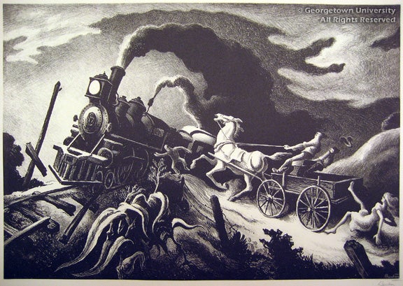
The Wreck of the Ol’ 97
Thomas Hart Benton (1889-1975)
1944
Lithograph
262 x 380 mm
Gift of the Murphy Collection
1987.21.38
Loosely based on an actual train derailment in Virginia, The Wreck of the Ol’ 97 depicts the impending collision of man, animal, and machine. A steam locomotive prominently juxtaposed with a horse and cart crashes old against new in a countryside setting. Dark and demonic, the train challenges the frightened white horse to a race only one can win. Visually, strong contrasts and undulating curves echo the climactic nature of the coming impact and the perilous uncertainty of new technology.
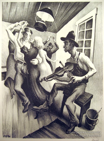
I Got a Gal On Sourwood Mountain
Thomas Hart Benton (1889-1975)
1938
Lithograph
317 x 234 mm
Gift of the Murphy Collection
1987.21.12
The son of a Missouri senator, Thomas Hart Benton defied family tradition by pursuing art. Though he studied in Europe, it was upon his return to his hometown of Neosho, Missouri, that Benton developed his uniquely American style. He often conveyed the aural sensations of regional music by contrasting black and white tones in an abstract way. In I Got a Gal On Sourwood Mountain, one stumbles upon an impromptu dance hall gathering in the back room of a saloon, where sinuous dancers bend and curve into exaggerated shapes. Tightly composed and full of vibrant energy, one can almost hear the refrain, “Hi-diddy-O-diddy-diddy-I day,” ringing through the stylized diagonals of the room and the tense, yet harmonious arrangement of the figures.
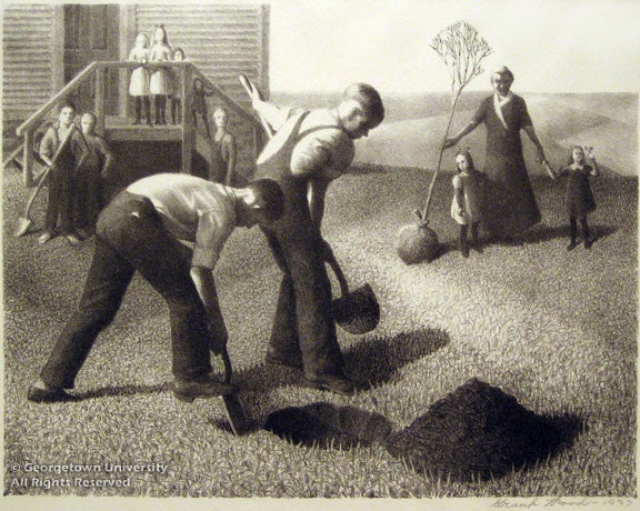
Tree Planting Group
Grant Wood (1891-1942)
1937
Lithograph
214 x 276 mm
Library Purchase 1984
1984.2.87
The regionalist artist Grant Wood was born on a farm in Anamosa, Iowa, a true Midwesterner. Although Wood received art training in Europe during the 1920s, he famously stated that “all the really good ideas I’d ever had had come to me while I was milking a cow…so I went back to Iowa.” For Wood, art was central to the promotion of American culture. Perhaps best known for his painting American Gothic (1930), Wood began making lithographs in 1937, when he and Thomas Hart Benton were working for the Associated American Artists (AAA). Wood’s peaceful and fertile landscapes contrast with the poverty and unemployment of the Great Depression. Tree Planting Group embodies both the rural work ethic and its promise of a peaceful life derived from the abundant Midwestern soil. Depicting the annual Arbor Day of the Great Plains, this print depicts an idyllic landscape and dedicated laborers. Here there are no smokestacks, no machinery, no signs of industrialization. The finely hatched lines echo the precision and stylized design; the simple folk interact seamlessly with the lush farmland.
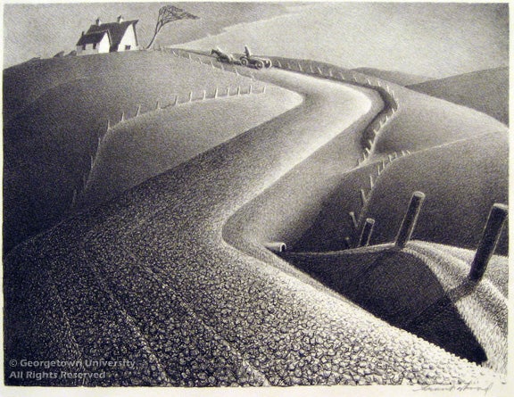
March
Grant Wood (1891-1942)
1939
Lithograph
226 x 301 mm
Library Purchase 1984
1984.2.55
In March, one of a series of prints representing the months, Wood depicts the cold, barren winter. A chill wind blows over the bleak prairie field, stripped of trees and blanketed in frost, blurring the detailing of the crops. A dramatically curved road leads the eye in an exaggerated motion toward a horse drawn cart and simple farmhouse. Wood maintains the regionalist ideal of a reciprocal relationship between man and the land; the subtly drawn image comforts the viewer with its familiar scene of rolling hills and a quaint, country farmhouse.
ABSTRACTION
Abstraction deconstructs representation, rejecting the imitation of reality in favor of an imaginative expression of reality. Prior to World War I, American art was traditionally representational, lauded domestically for its so-called realism. During the period between World War I and World War II, many European artists immigrated to the United States, bringing with them the philosophies and techniques of avant-garde movements such as Cubism and Surrealism. In printmaking as well as painting and other media, American artists explored the possibilities offered by abstraction, creating non-narrative, non-representational works that invoke visceral and spiritual realities.
Apparition
Werner Drewes (1899-1985)
1945
Color woodcut
231 x 312 mm
Gift of Charles Quest
1990.10.1
Born in Germany, Werner Drewes studied at the Bauhaus school of avant-garde art and architecture during its tenure in Weimar, the first of three cities it occupied during its existence. In 1930 Drewes immigrated to the United States and almost immediately helped found the New York-based organization of American Abstract Artists. Throughout his career, Drewes worked predominantly with abstract color woodcuts. The medium of the woodcut allowed him complete involvement in the printing process; instead of sending his creations to a master printer or running them through a press, Drewes used the back of a spoon to transfer the image onto paper. Compositionally, Apparition conjures a sense of dynamic tension by juxtaposing hard and soft shapes in hues of black and purple-brown. The artist created this impression by printing the sheet of paper twice, with two separate blocks inked with different colors.
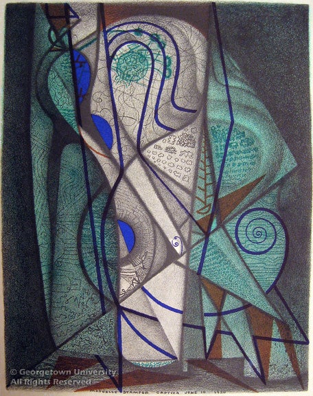
June 10 Song
Maybelle Richardson Stamper (1907-1995)
1950
Color lithograph
247 x 185 mm
Library Purchase 2000
2000.32.1
In 1946 Maybelle Stamper moved to Captiva Island off the coast of Florida, leaving behind the New York art scene and her career as a professor at the Cincinnati Art Academy. Until her death in 1995, she lived in isolation and produced a rich body of works, including June 10 Song. In this color lithograph, the artist juxtaposed lines and geometric shapes with curves and biomorphic forms, employing the visual languages of Cubism and Surrealism. Her inclusion of the word “song” in the title suggests synesthesia; in the undulating forms and colors of the print, one senses a melody. The result is a mystical work of art, a record of introspection.
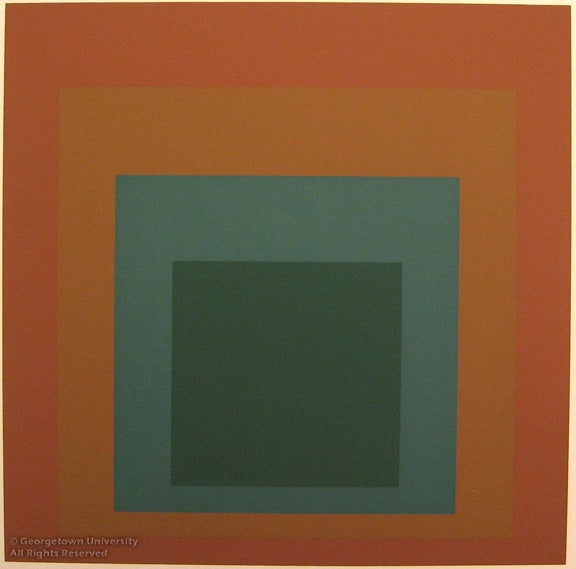
Homage to the Square
Josef Albers (1888-1976)
1959
Color serigraph
280 x 280 mm
Gift of Murray Lebwohl
1993.29.2
German by birth, Josef Albers taught at the Bauhaus, the progressive school for architecture and design in Dessau, until it was closed by the Nazis in 1933, prompting Albers’s immigration to the United States. Albers’s graphic works especially exhibit the bold, abstract forms typical of Bauhaus artists. Homage to the Square is one of two prints in the Georgetown Special Collections from the portfolio Homage to the Square: Ten Works by Josef Albers. The artist experimented with the juxtaposition of greens and blues in his standard composition of four nested squares. As Albers observed, “With two separate colors in no way overlapping, three are produced through interaction. Each borrows from and gives to the other. Where they meet, where they intersect, a new color results. In science, one plus one is two, but in art it can be three.”

Egyptian Series #10
J. Jay McVicker (b. 1911)
1986
Aquatint; Soft Ground; Collage
253 x 375 mm
Library Purchase 1987
1987.4.5
Life-long Oklahoma resident J. Jay McVicker experimented with styles associated with Romanticism and Cubism before eventually embracing abstraction as his mode of choice. He worked almost exclusively with aquatint and often incorporated other methods into his prints. For example, in Egyptian Series #10 he included softground and collage techniques along with color aquatint. The use of softground in this work is distinctive because the artist employed imprints of real objects. By cutting shapes into the print and attaching brightly colored paper behind the holes, McVicker also created a three-dimensional reality to contrast with the flatness and textured illusionism of the softground objects. The artist produced yet another layer of complexity by using differently colored inks to create shapes seemingly unrelated to his objects and their placement within the print. Egyptian Series #10 triumphs as both a technical tour de force and an intellectual exercise in the play of reality and illusion.
Professor Elizabeth Prelinger
Exhibition Director
Keyser Family Professor of Art History
Dept. of Art, Music & Theater
Joseph A. Haller, S.J.
Curator Emeritus of Fine Prints
LuLen Walker
Exhibition Designer
Christen E. Runge
Production Specialist and Web Designer
With special thanks to master printmaker Albert “Scip” Barnhart,
for printing the Tuthill lithograph and loaning the stone and printmaking tools,
and artist William Tuthill for making his work available for the exhibition.
Student Curators
From ARTH 457-01 Seminar: American 20th Century Prints
Section I: Introduction/What is a Print/Printmaking Techniques
Matthew Smith and Kathleen Sullivan
Section II: Joseph Pennell
Cara McMahon and Clare McKenzie
Section III: The Modern City
Kanani Hoopai and Kelly Young
Section IV: World War I
Julia Tarnell and Laura Nagy
Section V: WPA
Erika Nelsen and Alassandra DeSisto
Section VI: Regionalism
Van Bloys and Sarah Crocker
Section VII: Abstraction
Laura Blewett and Janet Orrock